EXECUTIVE SUMMARY There are indications of a housing affordability problem in the United States. As in the past, exclusionary zoning appears to be having a significant negative effect on housing affordability. There appears, however, to be a greater emerging threat. The rapid adoption of exclusionary planning policies, through smart growth, already appears to be severely impacting affordability and has great potential to do much more to make housing less affordable. At the same time, smart growth does not appear to have compensating benefits for eligible recipients of housing assistance or for housing assistance programs in general. This report reviews broad economic indicators of housing affordability and the impact of exclusionary policies on housing affordability (exclusionary zoning and smart growth). The findings are summarized below (Table ES-1). Indicators of Housing Affordability Finding 2.1: Lowest quintile incomes continue to rise at a slower rate than average, but the rate of increase has improved substantially in recent years. Historically, incomes of the lowest quintile households tend to rise at a rate less than average. By far the strongest lowest quintile income increases in recent years have been registered since the enactment of welfare reform, as income levels for the lowest quintile rose at more than double the rate of any similar period since 1980. Finding 2.2: The actual demand for housing subsidies is not known due to discrepancies among federal income and expenditure reporting systems. Generally, households that must spend more than 30 percent of their income on rent are eligible for federal housing assistance. But, because there are widely varying indicators of income, the extent of the housing assistance need cannot be definitively known. The Bureau of Labor Statistics (BLS) Consumer Expenditure Survey indicates that lowest income quintile households spend 2.3 times their income and that expenditures exceed income in quintiles two and three. The Bureau of the Census, based upon the Current Population Survey (CPS), estimates lowest quintile incomes somewhat higher, but still well below the expenditure level reported by BLS (expenditures are 1.7 times CPS income). It seems implausible that low-income households are spending 1.7 times their income every year. Most housing assistance demand estimates use CPS figures. If, for example, the BLS expenditure estimate is a more accurate indicator of average household income, then the extent of the housing affordability problem would be considerably less. Finding 2.3: Home ownership is generally increasing, and increasing most rapidly among minority households. During the 1990s, the nation enjoyed the most widespread gains in home ownership since the 1950s, and now stands at a record level. At the same time, minority home ownership has been rising at three times the rate of White-Non-Hispanics. Finding 2.4: Owner occupied housing affordability has declined somewhat over the past decade. However, housing affordability has dropped significantly in some states and metropolitan areas. House values rose 20 percent relative to income in the 1990s. In some states and metropolitan areas, affordability increased substantially. However, in others there was a serious decline. The least affordable areas are all in California, the Boston area, the New York metropolitan area and Portland, Oregon, where the median income household cannot afford more than one-half of the homes. Finding 2.5: Rents have remained comparatively constant in relation to low-income household income in the last decade. There is some variation in the experience with rental costs relative to income. Some measures indicate slight declines in affordability, while others indicate slight improvements. Most measures, however, indicate that a slight improvement in affordability in the last five years. Finding 2.6: There are indications of a shortage of affordable housing units, especially in particular geographical areas. Rental vacancy rates have fallen slightly at the national level over the past decade. However, there have been sharp drops in vacancy rates in a number of metropolitan areas. Vacancy rates are especially low in California and in the New York and Boston metropolitan areas, the same areas that exhibit some of the most severe owner occupant housing affordability problems. Finding 2.7: The indicators outlined above do not indicate a significant nation-wide housing affordability problem. However, there are indications of serious problems in some areas. The broad indicators of affordability indicate a somewhat mixed situation. Incomes are rising and rents are generally stable. Moreover, it is possible that, due to income reporting discrepancies, the extent of unmet housing assistance need may be less than previously estimated. On the other hand, vacancy rates have fallen significantly in some areas, likely indicating a shortage of rental units, while housing affordability has remains low in some areas and has declined sharply in others. Barriers to Housing Affordability Exclusionary zoning and growth controls were cited in the early 1990s Kemp Commission report as significant barriers to housing affordability. Exclusionary zoning remains so, but growth controls, in the form of so-called “smart growth” policies that ration development and land, have emerged as a more serious threat, due to their broad and rapid adoption. Smart growth has arisen as a reaction to urban sprawl, the spatial expansion of US urban areas that has occurred since World War II, as urban populations have increased (and urban population densities have declined). What is not understood by many US observers, however, is that urban sprawl is occurring virtually everywhere that affluence is rising, and that the relative rate of sprawl (density reduction) is actually greater in Europe, Asia, Canada and Australia, than it has been in the United States. Finding 3.1: As noted in the Kemp Commission report, exclusionary zoning continues to limit housing. Exclusionary zoning, the practice of limiting entry into local housing markets by lower income and particular ethnic populations continues to be a barrier to housing affordability. This can be accomplished by requiring lower densities than the market would produce or even by outrightly prohibiting low-income housing such as apartment units. One frequently occurring practice is the prohibition on lower cost housing types, such as manufactured housing and modular housing. Some of the most notable exclusionary zoning problems are in the Boston and New York metropolitan areas, which are among the nation’s least affordable markets. Finding 3.22: Smart growth’s development impact fee strategy reduces housing affordability. The smart growth exclusionary planning strategy of development impact fees creates substantial barriers to housing affordability and impose disproportionate costs on low-income households. Many communities have implemented development impact fees, which are assessed on new single family and multiple unit residences to finance new infrastructure. This practice has replaced reliance on general taxation and bonding, which was the historical approach to infrastructure finance. While there are arguments for making development “pay for itself,” this particular strategy has increased the cost of housing in areas where it is used. A University of Chicago study found that, in the Chicago area, development impact fees increased the cost of all housing, not just the cost of new housing. In the San Francisco Bay area, development impact fees reach nearly $65,000 per new owner occupied unit, and more than $40,000 for rental units. In one community development impact fees are equal to $0.62 per $1.00 of rental unit construction value. Development impact fees ration both owner occupied and multiple unit housing, thereby raising prices and impairing affordability. The impact on affordable housing is regressive, since development impact fees are the same, regardless of the value of unit being constructed. Finding 3.23: Smart growth’s land rationing, especially urban growth boundaries reduces housing affordability. Consistent with economic theory, rationing land, especially through the smart growth exclusionary planning strategy of urban growth boundaries, increases housing costs and reduces affordability. Because lower income households are more financially vulnerable, they shoulder a disproportionately greater share of the burden. A number of areas have adopted “smart growth” strategies that ration the amount of land available for development. Examples are urban growth boundaries, down zoning, and other strategies that artificially reduce the amount of land available for development. This has had the effect of reducing competition, thereby increasing the cost of the factors of production, limiting housing supply and reducing affordability. A case in point is the Portland (Oregon) area, where the National Association of Homebuilders Housing Opportunity Index has declined 44.5 percent (percentage of homes in the area affordable to the median income household) in the last 10 years. Portland had by far the steepest affordability drop among major metropolitan areas. Similarly, Bureau of the Census data indicates that Oregon, with its statewide exclusionary planning (smart growth) laws, led the nation from 1990 to 2000 in both housing value escalation and the increase of housing values relative to incomes (both by a wide margin). The upward cost pressures of land rationing on the single family housing market also tend to increase rents, increasing housing burdens for both recipients of housing assistance and those eligible for whom there is insufficient public funding for finance. Finding 3.24: Smart growth is associated with lower overall lower home ownership rates and lower Black home ownership rates. Lower overall home ownership rates and lower Black home ownership rates are associated with areas more consistent with the higher densities that smart growth requires. A fundamental requirement of smart growth is higher population densities. Yet, higher population densities are associated with lower levels of home ownership. Recent research also indicates that Black home ownership is lower and Black dwelling unit size is smaller in areas with higher population densities. The higher costs that are associated with smart growth have the potential to increase the number of households eligible for housing assistance, to make it more costly to serve present recipients, and, as a result, to reduce the number of households that can be served. Finding 3.25: Smart growth is associated with higher household expenditures. Lower overall household expenditures are associated with metropolitan areas that sprawl more, which benefits all income classes and makes it possible to serve more households with housing assistance. As would be expected, expenditures for transportation are higher in areas that sprawl more. But the lower housing costs in the more sprawling areas more than compensate for the transportation cost differential. Food costs are also lower where there is more sprawl. The higher costs associated with smart growth have the potential to increase the number of household eligible for housing assistance, to make it more costly to serve present recipients, and, as a result, to reduce the number of households that can be served. Finding 3.26: Smart growth is associated with greater traffic congestion, longer commute times and more intense air pollution. Contrary to popular perception, traffic congestion and air pollution are less intense in areas that sprawl more. This is indicated by both the US and international evidence. Transit is generally slower than the automobile; even where high levels of transit are available. As a result, journey to work travel times are less in more sprawling areas, including for low-income workers. Similarly, the hope urban areas might be redeveloped to better match jobs and residences, leading to a fundamental change in travel patterns, is unrealistic. Fundamentally, the transportation demand reducing objective of “walkability,” “transit-oriented development” and “mixed-use” urban designs is likely to have no more than marginal impacts. Modern urban areas are large employment and shopping markets. The compartmentalization that these schools of urban design would require is simply at odds with how people choose to live, work and shop. In the modern urban area, people often choose to work or shop at areas that are not particularly close to where they live. The same is true of low-income households. It makes little sense to expect that changes in the urban form can bring jobs and shopping closer to people when people seem disinclined to shop or work at the closest locations today. Even if there were a broad commitment to the required and significant land use changes, the conversion process would take many decades for material change to occur, and a serious vision of the changes that would be required and how they would be achieved has not been articulated. In the much more dense and more transit-oriented urban areas of Europe that might be looked to as models, virtually all growth in recent decades has been in the suburbs, which rely principally on the automobile. The political and economic reality is that there is no prospect for redesigning urban areas in a manner that materially improves employment mobility opportunities for eligible recipients assistance in the near future. Further, the often tax-supported trend toward infill development in central cities could displace low-income households, forcing them to move to areas farther from employment and transit service. Low-income employees have work trips that are similar in duration to that of all commuters and are only marginally more highly represented among workers traveling more than one-hour each way to work. Finding 3.27: Smart growth is associated with reduced accessibility to labor markets, especially for low-income households. Low-income households are most likely to achieve their employment potential if their geographical labor market is larger, rather than smaller. The automobile generally provides access to the largest possible labor market. The lowest income households that are eligible for housing assistance have generally less access to automobiles than other households. For decades, the overwhelming majority of new jobs have been created outside the urban cores. On average, 90 percent of urban jobs are now outside downtown areas. Generally, these jobs are simply not accessible by transit in a reasonable travel time (if at all) to the overwhelming majority of residential locations in the urban area. Because of slower transit speeds, the labor market available to the average automobile commuter is approximately five times the area available to the average transit commuter. The most important objective for improving low-income access to larger labor markets is to increase automobile availability. The high cost of transit makes it impossible to provide the comparatively rapid mobility throughout a large urban area that is available by car. The political and economic reality is that financing present levels of transit service is a challenge in many metropolitan areas and implementation of the transit service levels that would bring a material improvement for eligible recipients is inconceivable. It makes more sense to improved income mobility by encouraging automobile ownership than to vainly seek reformation of an urban form toward the end of bringing jobs and shopping to low income people. Finding 3.28: Because it is not feasible to negate its affordability destroying impacts, smart growth works at cross-purposes to the nation's housing assistance programs. Even today, the nation does not remotely provide the funding level that would be required if all households eligible for housing assistance in fact received housing assistance. Moreover, there seems to be no short-term likelihood that substantially greater funding will be provided. Smart growth imposes affordability losses across the income spectrum, not just on low-income households. It is not feasible to design housing subsidy programs that would compensate in any systematic or comprehensive way for the housing affordability loss generated by smart growth. At whatever level of public expenditure, exclusionary planning must reduce the number of households for which housing assistance can be afforded. Widespread adoption of exclusionary planning is likely to reduce home ownership levels and could reverse the substantial progress toward the national goal of greater home ownership. This burden will fall most on lower income households, which are disproportionately ethnic minorities. Thus, an indirect impact of exclusionary planning could be to reverse progress toward another national goal, integrating minority households into the economic mainstream. Smart growth could render the present home ownership level unsustainable, much less additional progress. The inevitable affordability destroying impacts of smart growth (exclusionary planning) are at their root inconsistent with policies that would seek to ensure adequate shelter for all. Finding 3.29: Smart growth’s exclusionary planning policies, especially development impact fees and urban growth boundaries, could represent a principal threat to housing affordability. Economic theory indicates that, all things being equal, policies that ration (create shortages) raise prices. Excessive regulation, discouraging economic activity (such as development) and rationing factors of production (such as land) all create shortages. By artificially driving up the cost of housing, exclusionary zoning and exclusionary planning at least partially nullify housing assistance expenditures, thereby increasing the need for housing assistance. Exclusionary planning is likely to drive development from areas that have adopted smart growth to areas that have not. It could even result in the rise of informal, substandard housing communities outside the highly regulated areas, and induce further sprawl and driving. Finally, smart growth could result in the emergence of two classes of metropolitan areas --- the more elite that adopt the exclusionary planning policies that artificially raise housing prices and the less elite, which do not. It might be
argued that the consequences of smart growth’s exclusionary planning would be
acceptable if there were more than compensating benefits. But smart growth does
not appear to produce benefits that compensate for its apparent destruction of
housing affordability. Where there is less sprawl (where urban development is
more consistent with smart growth policies):
· Home ownership rates are lower. · Low-income household home ownership rates are lower. · Black home ownership rates are disproportionately lower. · Cost of living expenditures are higher. · Work trips take longer · Traffic congestion is greater · Air pollution is more intense These are not outcomes that improve the quality of life, whether for the population in general or eligible recipients of housing assistance in particular. The rapid adoption of smart growth, because of its inconsistency with economic dynamics, is likely to significantly reduce housing affordability. Policy Options: Based upon the analysis above, the following policy options are suggested to encourage improved housing affordability: Income Estimation: · The U.S. Department of Commerce, the U.S. Department of Labor and the U.S. Department of Housing and Urban Development could establish a process for determining the cause of these disparate estimates and propose methods by which accurate and consistent data can be developed and routinely reported by both reporting systems. · Once the more accurate system is in place, US Department of Housing and Urban Development could prepare an estimate of the number of households eligible for housing assistance. Exclusionary Planning (Smart Growth) and Exclusionary Zoning · The Secretary of Housing and Urban Development could recommend to the President the issuance of an executive order reaffirming the fundamental commitment of the U.S. Government to continued home ownership expansion and housing opportunities for all. The order could review the progress toward increasing home ownership among the population in general and with respect to minorities in particular. The executive order should, within the constraints of applicable law, forbid the use federal funding by federal departments and agencies for programs that promote smart growth policies that would ration land or development (such as urban growth boundaries or development impact fees) and are thereby likely to reduce housing affordability. · The U.S. Department of Housing and Urban Development could publish an Urban Development and Housing Affordability Guide Book for local communities on the negative impacts of regulatory barriers to housing affordability, with particular emphasis on the impacts of exclusionary zoning and smart growth’s exclusionary planning policies. The Urban Development and Housing Affordability Guide Book could include information with respect to the quality of life impacts of smart growth policies for eligible recipients of housing assistance. · The U.S. Department of Housing and Urban Development could prohibit the use of research and technical assistance funding for the support of projects and programs that contribute to the problem of housing affordability, such as exclusionary zoning, and exclusionary planning (land rationing and development impact fees) · The U.S. Department of Housing and Urban Development could establish and maintain a comprehensive, locality specific database of regulatory barriers such as urban growth boundaries, other land rationing initiatives, development impact fees (including amounts) and any other such provisions inconsistent with the established economic principle that rationing leads to higher prices and reduced housing affordability. Once such a database is developed, the US Department of Housing and Urban Development could produce an annual report on progress toward removing regulatory barriers to affordability and develop policy options (actual federal and models for states and localities) to encourage removal of barriers to affordability.
1.0 INTRODUCTION Housing affordability is measured by the relationship between income and the cost of housing. Improving housing affordability, therefore, requires increasing incomes relative to housing costs or reducing housing costs relative to incomes. From a policy perspective, this requires measures that encourage the lowest feasible housing costs (competitive costs) and/or sufficiently high incomes, which are generally associated with higher levels of employment. Thus, policies options that reduce housing costs increase affordability, while policies that increase incomes increase affordability. Governments in the United States provide housing assistance to low-income households. But there is a limit the amount of funding that public processes will make available for housing subsidies. In the long run, housing affordability will be more sustainable if the market produces housing at a low enough cost for the largest number of households to afford at market determined incomes. Again, as in the case of welfare, such a policy goal is more likely to be achieved if employment levels among recipients of housing assistance are higher. For decades, public policy in the United States has favored home ownership. In response, home ownership is now at its highest recorded level, 67.4 percent.[1] But there are threats to continued progress and even indications that housing affordability could decline in the future. Affordability losses not only make it more difficult for low income households to live in decent accommodations, but it also reduces their ultimate potential to achieve home ownership and the greater affluence with which it is associated. However, there is evidence of a housing affordability crisis in the United States. · The United States Department of Housing and Urban Development (HUD) has found that affordable housing units have declined over the past decade and that the decline accelerated from 1997 to 1999.[2] · In some metropolitan areas, the price of single-family dwellings has risen so much that even middle-income households find it difficult to afford homes, such as in the San Francisco Bay area. · In the early 1990s, the Kemp Commission identified various barriers to housing affordability. These barriers continue to interfere with housing affordability today.[3] This paper reviews the housing affordability situation in the United States using broad economic indicators and reviews the impact of exclusionary policies on affordability, especially smart growth. Generally, households are eligible for federal housing assistance if their housing expense (rent plus utilities other than telephone) exceeds 30 percent of income. However, housing assistance funding is considerably below the amount that would be required to assist all eligible recipients. In 1999, the General Accounting Office estimated that more than two-thirds of eligible households do not receive housing assistance (Table 1).[4] As a result, households that are eligible are placed upon waiting lists, sometimes for years, before they can obtain housing assistance. Thus, based upon the current definition of eligibility, housing assistance is rationed. Among eligible households that do not receive assistance, more than one-half are considered “worst case needs,” by virtue of rent[5] expense that exceeds 50 percent of household income. Another 30 percent of unassisted households have rent expense between 30 percent and 50 percent of income.
2.0 INDICATORS OF HOUSING AFFORDABILITYThis section examines various broad economic and geographic indicators of housing affordability, both with respect to owner occupied and rental housing. 2.1 HOUSEHOLD INCOME During the 1990s, incomes generally rose among lower income households. From 1990 to 1995, average incomes rose 0.3 percent annually in the lowest income quintile, and in the latter one-half of the decade average incomes rose 1.7 percent annually (2000$).[6] This 1995 to 2000 increase rate was by far the highest in the last 20 years for the lowest income quintile (Table 2).[7] Virtually all of the increase in the last five years occurred since welfare reform was enacted (1996). Moreover, lowest quintile income rose 10.3 from 1990 to 2000, more than the 9.6 percent increase in overall median income. The impact, however, of the present economic downturn is not yet known. Finding: Lowest quintile incomes continue to rise at a slower rate than average, but the rate of increase has improved substantially in recent years.
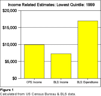
2.2 HOUSEHOLD INCOME REPORTING DISCREPANCIES There is some question as to the actual extent of need for housing assistance. There are material discrepancies between income and related data reported by federal estimation systems (Figure 1).
But the Consumer Expenditure Survey indicates a much higher level of expenditures than income for households in the lowest quintile. In 1999, average expenditures, including tax payments, were $16,913. · Compared to the Bureau of Labor Statistics income estimate, lowest quintile households spent 2.33 times their income. If this is an accurate estimation of income, then lowest quintile households spent, on average, $9,649 more than their income in 1999. · Compared to the CPS income estimate, lowest quintile households spent 1.70 times their income. If this is an accurate estimation of income, then lowest quintile households spent, on average, $6,973 more than their income in 1999.
Moreover, BLS also estimates income at less than expenditures for households in Quintiles 2 and 3. Households in Quintile 2 have an annual deficit of more than $7,000, while households in Quintile 3 have an annual deficit of nearly $3,000. Even the higher CPS income estimate is lower than expenditures for Quintile 2, by approximately $850. The discrepancies between income and expenditures has been evident for some time. In 1989, the CPS income estimate for the lowest Quintile was $6,900 below expenditures, nearly duplicating the 1999 relationship. The BLS income estimate was $8,700 below the expenditure estimate, slightly below the 1989 amount.[10] It does not seem plausible that the lowest 40 to 60 percent of American households spend more than they receive in income. Further, it seems even more doubtful that households in the nation’s lowest income quintile spend from 70 to 133 percent more than they receive, year in and year out. These discrepancies could result from under-reporting of income, over-reporting of expenditures or some combination of the two. It would thus seem that, if the expenditure estimates from the Consumer Expenditure Survey are representative, they are also more reasonable approximations of actual income for the quintiles in which expenditures are reported to exceed income. There are other indications that there may be income under-reporting in the CPS data. Research by Rector, Johnson and Youssef indicated that that 1996 Census Bureau personal income estimates were approximately 30 percent below estimates in the National Income and Product Accounts system in 1996.[11] Further, they found an under-reporting of more than $500 billion in government cash transfer payments to individuals in the CPS income estimate. In the same year, the amount by which expenditures exceeded income in the BLS data for the bottom three quintiles was approximately $425 billion.[12]
Under-reporting of income by housing assistance recipients has received the attention of the HUD Inspector General. In 2000, the Inspector General estimated housing assistance overpayments in the amount of $935 million as a result of under-reporting income: Tenants often do not report
income or under-report income which, if not detected, causes HUD to make
excessive subsidy payments.[13] This potential income under-reporting is significant with respect to assessing the extent of need for housing assistance programs. This is illustrated by examining data from Lincoln, Nebraska, which in 1999 had per capita income approximately equal to the national average (Table 3).[14] Comparing the national lowest quintile data to HUD fair market rents for the Lincoln area yields the following: The fair market rent on a two-bedroom apartment in the Lincoln area would require 86.7 percent of the BLS Quintile 1 average income The fair market rent on a two-bedroom apartment in the Lincoln area would require 63.4 percent of the Census Bureau Quintile 1 average income The fair market rent on a two-bedroom apartment in the Lincoln area would be 37.2 percent of the BLS Quintile 1 average expenditures for 1999. This is less than one-half the BLS figure and 40 percent below the Census Bureau figure.
Finding: The actual demand for housing subsidies is not known due to discrepancies among federal income and expenditure reporting systems. 2.3 HOME OWNERSHIP National policy has sought to expand home ownership over the past 50 years. Homeownership yields significant external benefits. Home ownership is important to the nation’s wealth creation. Home equity was found to be the greatest source of household wealth in a 1995 HUD Urban Policy Brief. [15] This in and of itself would seem to justify policies that favor home ownership. Home equity is the largest element of the average household’s wealth.[16] Home equity can be used to finance college education, or new business startups. Denying home ownership to a significant percentage of citizens could have far reaching social implications. The Policy Brief also cited evidence that neighborhoods with higher home ownership levels tend to be more stable. The characteristic most associated with the “American Dream” is home ownership. Indeed, the Kemp Commission suggested that home ownership had become the “Universal Dream” [17] Home ownership reached a record 67.4 percent in 2001. The highest rate was in the Midwest, at 72.6 (2000) percent, followed by the South at 69.6 percent. The Northeast trailed at 63.5 percent, and the West was lowest at 61.8 percent (Table 4).[18] During the 1990s, home ownership rose 5.4 percent, which according to Fannie Mae is the most widespread increase since the 1950s.[19] The highest rates of increase were in the Midwest, at 7.5 percent and the West at 6.4 percent. Home ownership increased 5.8 percent in the South, but increased only 1.4 percent in the Northeast.[20] The increase in home ownership extended to low income households as well. Data in the Consumer Expenditures Survey indicates that home ownership in the lowest income quintile rose from 41 percent in 1989 to 43 percent in 1999, which at 4.9 percent was somewhat below the national increase of 5.4 percent (Table 5). Given its wealth producing characteristics, home ownership is principal means by which lower income minorities enter the economic mainstream. The greatest home ownership gains are now being achieved by Blacks and Hispanics, which virtually tripled the rate of increase of White-Non Hispanics over the last 10 years (Table 6). However, overall rates of minority home ownership continue to lag significantly, with both Black and Hispanic rates more than 35 percent below that of White Non-Hispanics. Finding: Home ownership is generally increasing, and increasing most rapidly among minority households.
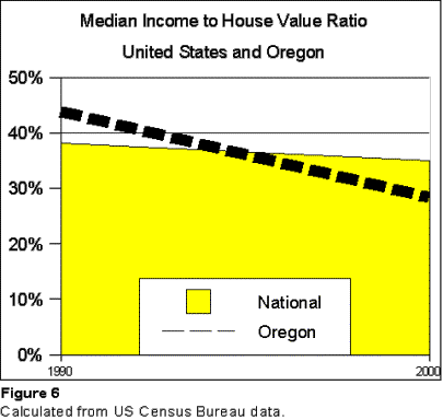
2.4 HOUSE VALUES This increase in home ownership came despite a significant increase in median home values. From 1990 to 2000, US median home values rose 19.6 percent (Table E-1[21]).[22] In 2000, the median house value was $120,500, compared to $100,800 in 1990, up 19.6 percent. Housing was most affordable in West Virginia, Arkansas, Oklahoma, Mississippi and North Dakota, where median values were $75,000 or less. The least affordable states were Hawaii, California, Massachusetts, New Jersey and Washington, where median values were $169,000 or higher (Table E-2). House values fell in 11 states, with the largest losses in Connecticut, Rhode Island, New Hampshire, New Jersey and California (Table E-3), ranging from minus 13.4 percent (California) to minus 26.3 percent (Connecticut). The largest increases in median home values were in Oregon, Utah, Colorado, Michigan and South Dakota, ranging from 42.2 percent in South Dakota to 74.6 percent in Oregon. House Prices and Affordability: One measure of affordability is the ratio between median household income and median house value. On average, median household income was 0.350 of the median house value in 2000. This represents an affordability loss of 8.3 percent from 1990, when the income to house value ratio was 0.381.There was, however, considerable variation by state (Table E-4). Relative to income, this measure indicates that houses are most affordable in Iowa, where the income to house value ratio in 2000 was 0.535. The least affordable state was Hawaii, with an income to house value ratio of 1.67 (Table E-5), Affordability improved the most in Connecticut, Rhode Island, Maine, California and New Jersey, ranging from Connecticut where the income to house value ratio rose 36.9 percent. Affordability by this measure declined the most in Oregon, at minus 35.4 percent (Table E-6). Metropolitan Areas: Similarly, housing affordability and trends have varied widely at the metropolitan level. The National Association of Homebuilders Housing Opportunity Index (HOI) measures the percentage of homes that can be afforded by the median income family in metropolitan areas (Table E-7).[23] The most affordable metropolitan areas are now Dayton-Springfield, Indianapolis, Kansas City, Syracuse and Harrisburg. In each of these metropolitan areas (and Youngstown, Ohio), the median income family can afford more than 80 percent of the homes in the area. All of the five least affordable metropolitan areas are in California, with San Francisco the lowest, where the median income family can afford only 6.7 percent of houses. Nearby Oakland, San Jose and Stockton are also among the least affordable metropolitan areas, as also is San Diego (Table E-8). All major metropolitan areas in which the median income family cannot afford more than one-half of homes are in California, the Boston and New York metropolitan areas and Portland, Oregon. Housing affordability improved in 58 of the 83 metropolitan areas. The greatest increases in affordability occurred in Ventura-Oxnard, Honolulu, Los Angeles, New York and New Haven, all registering above 100 percent. The greatest reductions in affordability occurred in Portland, San Francisco, Denver, Detroit and San Jose, ranging from a loss of 44.5 percent in Portland to 17.0 percent in Ann Arbor (Table E-9). Finding: Owner occupied housing affordability has declined somewhat over the past decade. However, housing affordability has dropped significantly in some states and metropolitan areas. 2.5 RENTS Generally, where single-family housing prices are higher, apartment rents tend to also be higher. Analysis of American Housing Survey metropolitan area data indicates that median rents are generally higher where housing prices are higher. During the 1990 to 2000 period, rents tended to increase at nearly $20 per month for each $10,000 increase in median house value or $96 for each $50,000 increase.[24] Over the past 10 years, average rents have declined slightly in the United States (inflation adjusted). The 1.2 percent decline is in contrast to the 19.6 percent increase in average house value (Table 7). During the period, rents peaked in 1993 at 6.7 percent above the 1989 rate, but have since fallen to 0.8 percent below 1989. While the current level of rent is burdensome for households eligible for housing assistance, the situation appears to have eased somewhat in the last decade. The average national rent dropped 8.6 percent relative to the income of the lowest income quintile, from 60.9 percent to 55.7 percent. At the mid-point of the decade (1994), the national average rent rose to 67.0 percent, but dropped to 1999. The mid-point rise was the result of falling real incomes and rising rents (Table 8). “Out-of-pocket” rent[25] dropped 0.8 percent relative to the expenditures of the lowest income quintile, from 47.2 percent to 46.7 percent. [26] At the mid-point of the decade (1994), the national average rent rose to 50.9 percent, but dropped to 1999 (Table 8).
As was noted above, it is also possible that the Consumer Expenditure Survey expenditures figure may represent a more accurate approximation of income in income quintiles where expenditures are reported to exceed income. · The average national rent declined from 34.3 percent of lowest income quintile expenditures in 1989 to 33.0 percent in 1999 (Table 9). · The average “out-of-pocket” rent[27] for lowest income quintile households increased from 26.6 percent in 1989 to 27.7 percent of income in 1999 (Table 9).
These improving trends are confirmed by the latest HUD Worst Case Needs Report. From 1997 to 1999 the number of worst case needs households (households in which rents exceed 50 percent of income) declined 440,000, a drop of eight percent. This represents a reversal of the trend of the previous decade.[28] HUD found that the principal reason for the improvement was rising incomes among worst case needs households. Finding: Rents have remained comparatively constant in relation to low-income household income in the last decade. 2.6 VACANCIES AND RENTAL HOUSING SUPPLY At the same time, rental vacancies remained comparatively constant. From 1990 to 2000, overall rental unit vacancies increased from 7.4 percent to 8.0 percent. The largest increase occurred in single units. At the same time, vacancies in buildings with multiple units have fallen from in the range of four to five percent (Table 10).
The national data, however, masks marked regional differences (Table E-10). In 1990, the nation’s lowest multi-unit vacancy rates were slightly below five percent (4.7 percent in Wisconsin and 4.9 percent in New York). By 2000, seven states had vacancy rates below five percent (Table E-11), and three had fallen below four percent (Massachusetts, New Hampshire[29] and California). The 2000 Census data indicates that the lowest vacancies are disproportionately concentrated in the San Francisco, Boston, Los Angeles and New York metropolitan areas (Table E-12). These metropolitan areas and other California metropolitan areas comprise two-thirds of the 41 markets in which vacancy rates are below 4.0 percent. Other major metropolitan areas at below 4.0 percent vacancy rates are Minneapolis-St. Paul and Austin. In addition, eight smaller metropolitan areas with large universities have vacancy rates below 4.0 percent.[30] In Boston, one of the nation’s least affordable areas, the governor of Massachusetts has noted that construction of multiple unit residences has fallen by more than one-half in relation to all housing construction during the 1990s. Moreover, Governor Swift noted that the rate of multiple unit development in Massachusetts was trailing the national rate by two-thirds.[31] It appears likely that higher immigration has resulted in much higher demand for rental housing in some urban areas, which may have been a major contributor to the lower vacancy rates in those areas (Appendix A). Further, there are indications that the supply of affordable rental units is declining. HUD reports that, from 1997 to 1999, there was a loss of 13 percent in housing units affordable to extremely low-income households.[32] By far the most significant problem was in the West, where there were just 59 affordable units for every 100 extremely low-income households,[33] well below the national average of 79. The Northeast (77), Midwest (84) and South (92) had higher ratios of affordable housing for every 100 extremely low-income households. Finding: There are indications of a shortage of affordable housing units, especially in particular geographical areas. 2.7 HOUSING AFFORDABILITY: ASSESSMENT The broad indicators of affordability indicate a somewhat mixed situation. Incomes are rising and rents are generally stable and it is possible that, due to income reporting difficulties, the extent of unmet housing assistance need may be less than previously estimated. On the other hand, vacancy rates have fallen significantly in some areas, likely indicating a shortage of rental units. Housing affordability is low in some areas and has declined sharply in others. Finding: The indicators outlined above do not indicate a significant nation-wide housing affordability problem. However, there are indications of serious problems in some areas. 3.0 BARRIERS TO HOUSING AFFORDABILITY In 1991, the “Kemp Commission,”[34] issued a seminal report on barriers to affordable housing. Its report, Not in My Back Yard, identified a number of factors that were, taken together, working to reduce the affordability of housing. The most important barriers were “excessive and unnecessary” regulatory barriers, often arising from resistance in neighborhoods to housing that would be less expensive. Two regulatory barriers identified by the Kemp Commission continue to ration affordable housing.
That these two factors continue to weaken affordability is indicated by a recent National Low Income Housing Coalition report (Out of Reach 2001), which found that all of the 10 least affordable metropolitan and county/local[36] rental markets were in areas that have been identified with exclusionary zoning or exclusionary planning difficulties (below).[37] This section examines the impact of both exclusionary zoning and smart growth’s exclusionary planning. 3.1 EXCLUSIONARY ZONING The history of zoning in the United States is complex and there are arguments both for and against the practice. Zoning is a strategy for excluding various types of development. This might be what are considered incompatible commercial uses in residential areas, or, as has often been the case, developments that house certain income classes or ethnic groups. In the final analysis, zoning provides incumbent owners extra-territorial jurisdiction over the property of others. Exclusionary zoning was identified by the Kemp Commission as one of the most important regulatory barriers to affordable housing. Exclusionary zoning is the use of local zoning powers to exclude types of housing development that are considered undesirable. Exclusionary zoning has been directed at keeping low-income households out of communities and neighborhoods, by restricting or even banning the more affordable types of housing, such as rental units, manufactured housing or modular housing. There is also evidence that exclusionary zoning has been used to keep particular types of households out of neighborhoods or communities, especially minority households.[38] Recently, a number of areas in growing metropolitan areas have sought to control growth through the use of the exclusionary zoning strategy of “down-zoning.” This exclusionary zoning strategy involves reducing the number of residences that can be built on a particular sized lot. This has the impact of raising costs by raising both the cost of land prices and infrastructure for single-family dwellings. Downzoning also makes it very difficult to build the multiple unit buildings that are relied upon to such a great degree by recipients eligible for housing assistance. Downzoning has been particularly popular in suburban areas of northern Virginia, adjacent to Washington, DC. The Boston metropolitan area has one of the nation’s most intense housing affordability problems. Governor Swift’s report (above)[39] attributes much of the cause to exclusionary zoning strategies that include overly large lot size requirements, provisions that make development more difficult or slow, and absolute prohibitions on multiple unit construction. In most communities, new housing must be developed at lower densities than the housing stock that already exists. These strategies often arise from a concern among municipalities that the public service cost of new residences in the community will exceed the tax revenue received to support the new services. Areas in which serious exclusionary zoning difficulties have been reported are well represented in the Out of Reach 2001 list of 10 least affordable areas.[40] This includes:
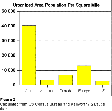
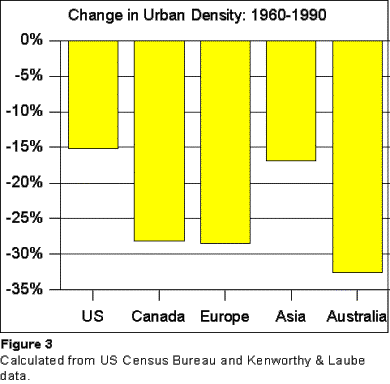
Finding: As noted in the Kemp Commission report, exclusionary zoning continues to limit housing. In recent years, considerable public policy attention has been given to the issue of urban sprawl. While definitions of urban sprawl are elusive,[42] generally urban sprawl is associated with lower or declining urban densities. American urban areas have historically been the world’s least dense (Figure 2). However, since 1960, urban densities have fallen at a faster rate in virtually all other developed areas of the world (Figure 3), as urban sprawl has been generally associated with rising incomes around the world. Even the most dense urban areas of Europe have sprawled significantly (Appendix D). At the same time, central cities throughout the developed world have lost population at their cores. In many central cities, this loss has been masked by annexation or consolidation with suburbs.[43] But where annexations and consolidations have generally not occurred, the population loss trend is evident. Among the 60 such high-income nation central cities that had achieved 500,000 population and were fully developed by 1950, only one (San Francisco) is at its population peak. Population and population density has declined in 59 of the 60 central cities.[44] All urban areas outside the United States for which data is available had lower densities in 1990 than in 1960.[45] A number of low density US urban areas have increased their densities over the same period of time, though remain far below European and Asian densities.[46] Further, US urban areas have been under much greater population pressure than their counterparts in Europe. Since 1950, US population growth has been at a rate more than three times that of the European Union.[47] Approximately 90 percent of that US population growth has been urban, rather than rural.[48]
Various concerns have given rise to anti-sprawl strategies, which are also referred to as “smart growth,” and “growth management.” Examples of smart growth strategies are:
The key to smart growth and anti-sprawl strategies is higher population densities. To achieve the goals of smart growth, such as reducing the use of automobiles, and reducing the amount of land under development requires future development to be at higher density than has typically been the case in recent decades 3.21 EXCLUSIONARY PLANNING THROUGH SMART GROWTH Two smart growth policies can be classified as “exclusionary planning,” by virtue of the fact that they exclude households, especially lower income and disproportionately minority households, from the housing market by artificially raising prices. Exclusionary planning policies include land rationing (such as urban growth boundaries) and development rationing (through development impact fees). The rationale for smart growth rests on a number of arguments related to the environment and quality of life. These rationales, however, are not without dispute (Appendix B). Areas in which extensive exclusionary planning is used are also in the Out of Reach 2001 list of 10 least affordable areas.[49] This includes:
3.22 EXCLUSIONARY PLANNING: DEVELOPMENT RATIONING Until comparatively recently, it has been the custom for US local governments to pay for infrastructure such as city streets, water systems and wastewater systems with general funds or bond proceeds. This began to change, however, with the passage of Proposition 13 in California (1978), which limited property taxes. Property tax rates were capped at one percent of valuation and annual increases were limited to two percent. This resulted in an immediate reduction of property tax revenues, but additional state aid was quickly made available to compensate for the loss. In fact, total per capita property taxes and state aid to local governments in California was nearly 13 percent higher in 1999[51] than in the last pre-Proposition 13 fiscal year (Table 11).[52]
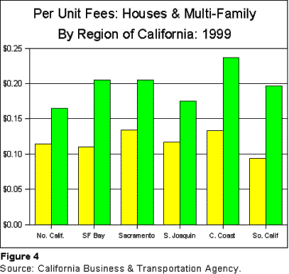
Nonetheless, the loss of property taxing revenues resulted in a search for other revenue increasing mechanisms. Local governments began to implement fees on new developments for infrastructure, rather than the more traditional general funds and bond revenues. Development impact fees tend to be a flat rate established by a local government, which is applied to a new house or a new rental unit, rather than being related to the value of the property under construction. The result is that the costs of new housing units are increased, and with a higher percentage increase for lower cost units. Development impact fees are generally applied to both single-family and multiple unit housing (Figure 4). By 1999 average development impact fees averaged nearly $25,000 per new subdivision house in California according to a study performed for the California Business and Transportation and Housing Agency (Table 12).[53] This represents $0.12 per $1.00 of construction valuation. On average, development impact fees account for enough to permit the construction of an additional house for each eight on which fees are assessed. Throughout the regions studied, total fees ranged from a low of $18,700 in the San Joaquin Valley to a high of $30,100 in the Central Coast. But the fees can be much higher. In Watsonville, total fees were approximately $60,000 per subdivision house, or $0.24 per $1.00 of construction valuation. This is enough to permit an additional house to be constructed for each four. Danville, not included in the state survey, is reported to have a development impact fee of $64,320.[54] This is barely 10 percent below the average price of a house in the least expensive state, West Virginia (Table E-2). Fees on infill single family housing were somewhat less,[55] averaging $20,300, or $0.10 per $1.00 of construction valuation. The highest average was in the San Francisco Bay area, at $26,800, while the low was in the San Joaquin Valley, at $14,600. This means that fees account for enough to permit the construction of an additional house per each ten. The city of Brentwood (eastern Contra Costa County) had the highest surveyed total fees in relation to construction value, at $0.28 per $1.00. The development impact fees on four houses are enough to pay for building a new house. Impact on multiple unit construction: But the impact is much more significant on multiple unit projects, as the situation in California indicates (Table 13). The average per unit fees were more than 1.5 times the rate per $1.00 in construction value of single family homes, at $0.19 ($15,500). The lowest per unit total fees were in the San Joaquin Valley, at $10,900, at $0.18 per $1.00 in construction value. The Central Coast was highest at $19,800, $0.24 per $1.00 in construction value. Again, the city of Brentwood had the highest development impact fee structure, at $41,200 per unit, or $0.62 per $1.00 in construction value. Nearly two new units could be constructed with the fees from three units built in Brentwood. California communities have some of the lowest multiple unit vacancy rates, reflecting a shortage of supply. This is not surprising in view of the exceedingly high development impact fees that are being used with the effect of restricting construction of multiple unit housing. High development impact fees on multiple unit construction are a material contributor to the housing affordability crisis faced by low-income households in the state.
.
Impact on the Supplier market: The impact on the supplier market is also significant. The California study found that the fees added significantly to the initial cash requirements of developers. In Los Angeles County, this amounted to an increase of 16 percent, while in Contra Costa County the cash requirement was increased 53 percent.[56] Such a requirement creates a significant financial burden on multi-unit developers and can be expected to reduce the number of firms that can or will compete in the market and the number of housing units produced. Proffers: Development impact fees are not permitted by the laws of some states. However, some jurisdictions have been able to use “proffers,” contributions from developers for infrastructure in exchange for project approvals.[57] Proffers have the same general economic impact as development impact fees --- they raise the price of housing and reduce affordability. Proffers are used extensively, for example, in the northern Virginia jurisdictions of suburban Washington, DC. Development Impact Fees & Impact on Affordability: A study by University of Chicago researchers[58] found that development impact fees in the Chicago metropolitan area increased the cost of both new and existing housing (Table 14).
Development impact fees are lower in suburban Chicago than in California, [59] though they might have a similar financial impact there. The University of Chicago researchers also found that development impact fees induced homebuilders to build more higher cost housing, to recover higher profit margins.
Rationing Development: Development impact fees ration the amount of housing that is constructed. It is not surprising that the nation’s highest housing costs and some of the nation’s lowest rental unit vacancy rates are in California, where development impact fees are used so extensively. Moreover, some counties in the San Francisco Bay area are rationing land through urban growth boundaries, which also raises the cost of housing (below). Impact on Low Income Affordability: Development impact fees have a particularly negative effect on housing affordability for low-income households:
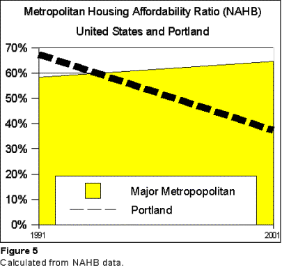
Finding: Smart growth’s development impact fee strategy reduces housing affordability. 3.23 EXCLUSIONARY PLANNING: LAND RATIONING Some areas have adopted land-rationing policies as a strategy for limiting urban sprawl. Two of the most popular strategies are urban growth boundaries and open space preservation. Urban Growth Boundaries Urban growth boundaries involve designation of land available for urban development, simultaneously making urban development outside the boundary illegal. The state of Oregon was the first to adopt this strategy, having enacted legislation in the 1970s that requires virtually all urban development to be within urban growth boundaries, established by metropolitan agencies and cities. A number of other areas have more recently adopted similar strategies, such as the states of Tennessee and Washington, the Denver[60] area, the Minneapolis-St. Paul area, the city of Austin[61] and Contra Costa and Alameda Counties in the San Francisco Bay Area. Land rationing raises prices: It is an established principle of economics that rationing raises prices. Land is no exception. The economic impact of urban growth boundaries, however, is not limited to the impact on land prices. The principal mechanism for ensuring market prices is competition. Where there is robust competition, the cost of goods and services is generally less than where there is less competition. By designating which land can be used for development, planning authorities reduce competition between developers and land speculators. With less land to develop, owners of land within the urban growth boundary can obtain higher prices. Both developers and builders who are able to obtain developable land can charge higher prices because there is no competition. Urban growth boundaries thus raise the costs of virtually all factors of housing development. Urban growth boundary legislation normally requires inclusion of enough land to accommodate development needs for a period of time (such as 20 years), but as the case of Portland (below) indicates, this is no guarantee that a shortage of land will not occur, as bureaucracies impose visions of greater density. Potential for political manipulation: There is also a potentially expensive and counter-productive political risk in land rationing. The land development process becomes much more politicized, as developers and landowners lobby regional land use agencies to include their properties, as opposed to that of others in urban growth boundary expansions. This creates the potential for inappropriate political contributions and other actions (sometimes referred to as “political corruption,”) as the regional land use agency is put in the role of “picking winners.” Portland’s Urban Growth Boundary: Portland is by far Oregon’s largest metropolitan area and is therefore the largest urban area in the state with an urban growth boundary. Portland’s urban growth boundary, as originally adopted in the late 1970s, included significant amounts of developable land. As a result the urban growth boundary created little if any shortage of land in the early years. Indeed, during the 1980s, even after adoption of the urban growth boundary, the Portland urbanized area (developed area) sprawled at a greater rate than all other major urban areas in the western states.[62] But in the 1990s, Metro, the metropolitan planning agency responsible for the urban growth boundary, made a political decision that Portland should become considerably more dense. Metro decided that, with higher densities, there was enough land for 20 years of development within the urban growth boundary little expanded from the late 1970s.[63] But, as land was more severely rationed by Metro, development consumed much of the land within the urban growth boundary, severe land rationing began to occur. As a result housing prices in the Portland area escalated in an unprecedented manner. Portland: Housing Affordability Loss: It was previously shown that the Portland area has had by far the largest reduction in housing affordability of any major metropolitan areas over the past ten years. The National Association of Homebuilders Housing Opportunity Index dropped 44.5 percent from 1991 to 2001, compared to an average 10.7 percent improvement. Portland’s affordability loss was considerably greater than that of the second worst performing market, San Francisco, at minus 27.2 percent (Table E-9). Portland’s loss of productivity was well outside the range of the other major markets. The gap between Portland and the market with the second worst loss in affordability is greater than the gap between the second and 10th worst affordability loss market. In 1991, Portland’s affordability was 16 percent above the national average. By 2001, Portland’s affordability had slipped to 42 percent below the national average (Figure 5). Beyond Portland: Similar losses in housing affordability have been sustained in smaller Oregon urban areas, with Eugene-Springfield dropping 55.1 percent and Salem falling 42.5 percent (Table 15). In addition, housing affordability declined sharply in Oregon from 1990 to 2000, as noted above.
San Francisco Bay Area: Similarly, the nation’s least affordable housing market, the San Francisco Bay area, exhibits a similar situation. While the more important factor there may be development impact fees (above), urban growth boundaries have been adopted in Contra Costa and Alameda Counties, two of the most urban counties in the area. The Contra Costa boundary has been in effect for a decade. Thus, at the same time that urban growth boundaries limit development in the urban area, middle income and affordable housing may be driven even further from the urban area. This is evident in the San Francisco Bay Area, where much new middle-income housing has “leap frogged” to the San Joaquin Valley, 50 to 80 miles from the urban area (such as the Stockton and Modesto areas). Impact on Low Income Households: Moreover, as was noted above, this loss of housing affordability for potential homeowners has an impact on rental markets as well. Generally, rents tend to rise with the cost of single-family housing. This is already evident in the extremely high rents in the San Francisco Bay Area, and can be expected to occur in other areas implementing urban growth boundaries as time goes on. Because they rely more on rental housing, and because they are more sensitive to housing cost increases, low-income households sustain disproportionate costs from urban growth boundaries.
Open Space Preservation Land rationing through open space reservation can also reduce housing affordability. Open space preservation has been among the most popular smart growth strategies in public referenda. While open space preservation can be a laudable objective, it generally encourages more urban sprawl, not less. “Leap-Frogging” in London: This is illustrated by London, with its renowned “Green Belt.” This undeveloped ring of approximately 10 miles width around what is now the Greater London Authority (GLA) was set aside from the 1930s to the 1950s. Since that time, the GLA population has declined 1.5 million, while the population of counties bordering on the Green Belt increased 3.5 million. Now, the London urbanized (developed) area is much less compact than it would have been if adjacent development had been allowed to continue. Development has “exploded” in large and small towns across nearly 3,000 square miles of southeast England. Total developed land is approximately 1,600 square miles.[64] This has lengthened average commute trips and times. London’s Green Belt may have created an aesthetically more pleasing urban area than if sprawl had been allowed to consume the land uninterrupted. But the effect of London’s open space preservation has been to “leap-frog” development to outside the Green Belt, increasing, rather than containing urban sprawl. Nonetheless, the impact of open space preservation is less pervasive than urban growth boundaries, because open space preservation in itself does not remove huge amounts of land from the potential for development. As a result, open space preservation is generally less destructive of housing affordability than urban growth boundaries. Land Rationing and Home Ownership The extent to which housing affordability has been eroded by urban growth boundaries in Portland’s or elsewhere is unclear. But the declining affordability trends are unmistakable. Moreover, they are consistent with economic expectations under the circumstances --- prices have risen while land has been rationed. Further the price increasing effect of Portland’s land rationing may not yet be fully apparent. The longer term impact on home ownership could be even more substantial.
Consistent with economic theory, rationing land, especially through the smart growth exclusionary planning strategy of urban growth boundaries, increases housing costs and reduces affordability. Because lower income households are more financially vulnerable, they shoulder a disproportionately greater share of the burden. Finding: Smart growth’s land rationing, especially urban growth boundaries reduces housing affordability. 3.24 SMART GROWTH AND HOME
OWNERSHIP Similar to the impact of exclusionary planning policies, lesser degrees of sprawl are is associated with lower rates of home ownership. According to Consumer Expenditure Survey data, home ownership tends to be higher where sprawl is greater (density is lower). Using the urban sprawl classifications developed by the Surface Transportation Policy Project (STPP),[67] the most sprawling urban areas average 70 percent home ownership, compared to only 57 percent in the least sprawling areas (Table 16).[68] Because minority households generally tend to have lower incomes, home ownership rates are lower on average. Smart growth’s exclusionary planning can therefore be expected to more negatively impact minority households, because it artificially increases housing costs. This is consistent with findings from a recent study by Matthew Kahn of Tufts University, which found that Black home ownership tends to be higher and Black household dwelling size is larger where there is more sprawl.[69] In the report, Kahn indicated: Affordability is likely to decrease in the presence of more antisprawl legislation. As was noted above, rents tend to be higher where house values are higher. Thus, as smart growth raises housing costs, it not only makes it more difficult for lower income households to achieve home ownership, but it also is associated with higher rental payments. This has the potential to increase both the number of eligible recipient households and costs per housing assistance recipient, which can work to reduce the number of households that can be assisted. Finding: Smart growth is associated with lower overall lower home ownership rates and lower Black home ownership rates.
3.25 SMART GROWTH AND THE COST OF LIVING Similarly, the costs of housing tend to be higher in areas that sprawl less. Again, using the STPP sprawl classifications and Consumer Expenditure Survey data, expenditures for shelter tend to be lower in metropolitan areas that sprawl more. Expenditures for shelter in the least sprawling urban areas were 36 percent higher than in the most sprawling urban areas. The difference in housing expenditures more than compensates for the expected higher transportation expenditures. Further, food costs were similarly higher where sprawl was the least. Overall, transportation, shelter and food expenditures in the least sprawling areas were 13.6 percent higher than in the least sprawling areas. It thus seems likely that overall transportation, housing and food costs for low-income households is less where sprawl is greater (Table 17). The higher overall costs may be the result of various factors, such as higher land prices in more dense areas, higher costs of doing business, higher costs of doing business due to greater traffic congestion and less competitive markets. Higher overall costs of living particularly burden low-income households, many of which are eligible for housing assistance. Moreover, higher the higher housing expenditures can increase the cost of housing programs, further rationing the number of households that can be assisted. Lower overall household expenditures are associated with metropolitan areas that sprawl more, which benefits all income classes and makes it possible to serve more households with housing assistance. Finding: Smart growth is associated with higher household expenditures.
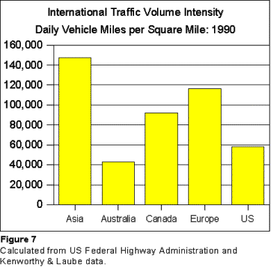
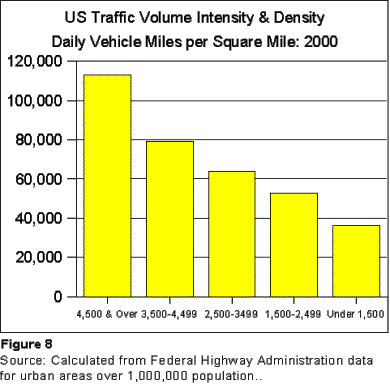
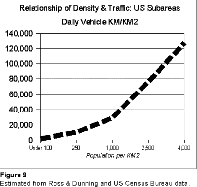
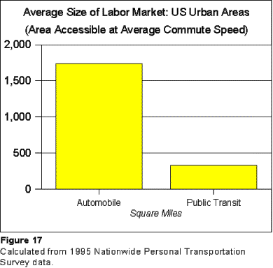
3.26 ELIGIBLE RECIPIENT TRANSPORTATION: SITUATIONThe achievement of higher population densities is a necessary, though not sufficient requirement for achieving the objectives of smart growth. The expected transportation related benefits of smart growth, such as reduced traffic congestion, reduced air pollution and reduced journey times, would therefore seem to be generally evident in more dense urban areas In fact, however, most measures indicate that the higher densities that smart growth would bring are associated with a lower standard of living and higher cost of living. As a result, smart growth increases the burden of low-income households, including those eligible for housing assistance. Traffic and Density: Traffic congestion is less intense where densities are lower. This perhaps counterintuitive situation results from a misunderstanding of the dynamics of traffic congestion and urban densities. It has often been suggested that urban sprawl is associated high higher levels of traffic. However, the very spreading out of the urban area that occurs with sprawl has the tendency to reduce, rather than increase traffic congestion. US measures tend to indicate lesser levels of traffic congestion in the less dense (more sprawling) urban areas (Figure 7). Gordon and Richardson have suggested that urban sprawl, with its lower densities, has been the safety valve that has kept US traffic manageable.[70] Similarly, traffic congestion tends to be even worse in the more dense international urban areas (Figure 8). Federal Highway Administration research indicates that, at average US urban densities, the number of vehicle miles traveled tends to rise at a rate of 0.8 percent to 0.9 percent for each 1.0 percent of increase in density.[71] This means, for example, that if an urban area were to double in population density the vehicle miles traveled per square mile would increase by from 80 percent to 90 percent (Figure 9).
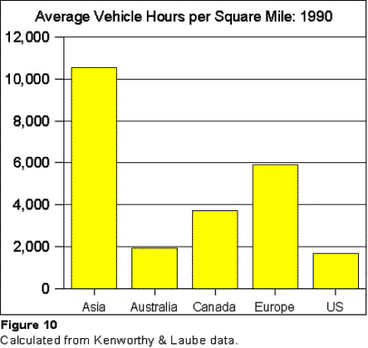
Traffic Speed and Density Further, as traffic density increases, speeds decline, further exacerbating density’s negative impact. For example, with their higher population densities, European urban areas tend to have traffic intensities double that of US urban areas. When the slower speeds that result from the greater traffic congestion are factored in, the time (vehicle hours) spent driving per square mile is more that 3.5 times that of US urban areas (Figure 10).
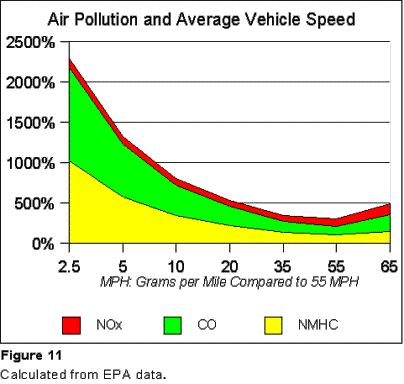
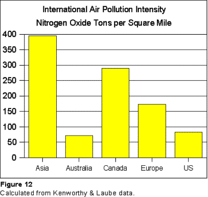
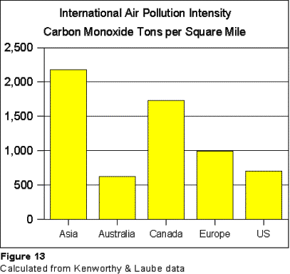
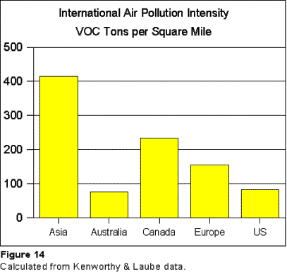
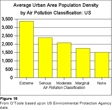
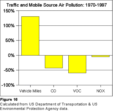
Air Pollution and Density: Moreover, air pollution generally tends to be associated with lower operating speeds and the “stop and go” operating conditions associated with traffic congestion. The higher operating speeds achieved in the less dense urban areas contributes to lower levels of pollution intensity (Figure 11). In the United States, automobile air pollution production is the least at constant speeds of 35 miles per hour to 55 miles per hour.[72] The faster speeds that are typical in the United States, combined with the lower traffic densities result in less intense air pollution than in international urban areas that are more dense (Figures 12 through 14). [73] Moreover, air pollution intensity is lower in US urban areas that have lower population densities --- the areas that sprawl more (Figure 15).[74] Finally, contrary to popular perception, gross air pollution production by automobiles has declined over the past three decades, at the same time that driving has increased more than 30 percent and urbanization areas has sprawled more than 100 percent[75] (Table 16).
Auto and Transit Speeds: Despite perceptions to the contrary, transit is considerably slower than the automobile. Generally, in the United States, average automobile commute time by automobile was reported by the Nationwide Personal Transportation Survey to be 20.1 minutes in 1995, less than one-half the transit figure of 48.7 minutes (Table 18). Average automobile commute speeds are 35.3 miles per hour, compared to 15.3 miles per hour for transit (including waiting time).[76] Indeed, the United States Department of Transportation has noted that improvements in average commute travel speeds are partially the result of: The switch from carpools and transit to
single occupant vehicle trips… [77]
As was noted above, Portland, Oregon has implemented the nation’s most aggressive land use regulations (smart growth), Portland has opened two light rail lines and has significantly increased overall transit service levels. According to the Texas Transportation Institute, Portland’s per capita traffic volumes increased more than that of any other urban area with more than 1,000,000 population.[78] In spite of its smart growth policies, Portland’s traffic congestion increased markedly from 1990 to 1999, and now ranks 8th in the nation, with a higher Travel Time Index[79] (congestion index) higher than Atlanta, which is renown for its traffic congestion.[80] Yet, automobile commute times remain approximately one-half that of transit.[81] In addition, commutes of one hour or more remain comparatively infrequent in the US, though increasing. The 2000 Census Supplemental Survey indicates that 7.3 percent of commuters traveled one hour or more to work. A much higher percentage of transit trips, 33.6 percent, were one hour or more. By comparison, 6.1 percent of trips by other modes (principally automobile) were one hour or more Table 19). Similarly, transit’s share of total work trips rises as travel time increases. While transit’s share of work trips is 5.2 percent nationally, its share of work trips one hour or more is 24.6 percent, nearly five times as high. Again, even in Portland, where smart growth strategies have been implemented with the most comprehensiveness, the one-hour and longer category represent has a transit work trip market share nearly five times that of the area in general (Table 20).[82] Journey to Work: Lower density (more sprawl) is associated with shorter, rather than longer commute times. In 1990, workers in the most dense US urban areas spent nearly one-quarter more time commuting than those in the lowest density urban areas (Table 21), or 40 additional hours annually. The same situation exists in international urban areas. One of the frequently cited objectives of some growth is to replicate the more dense European city form. In fact, the data indicates that, on an international basis, longer journey to work times are also associated with higher density, not lower density urban areas. The most dense urban areas tend to have average commute times 45 percent longer, with commuters spending 76.6 hours more traveling to work than those who live in the least dense urban areas (Table 22).[83] This is evident in a comparison of individual urbanized areas. Shorter journey to work travel times tend to be associated not only with lower density, but also with lower public transit market shares (higher automobile market shares). For example, Stockholm, often cited as a model of urban effective planning, has an average commute time of 32.2 minutes. Phoenix, which is especially illustrative of urban sprawl (low density and little concentration of employment, with a comparatively small downtown area) has an average commute travel time of 22.9 minutes. The average commuter in Phoenix spends approximately 80 hours less each year traveling to work as in Stockholm, despite the fact that Phoenix has one-third more population and an urbanized land area nearly five times as large (Table 23). Low Income Household Commute Times: Low-income households[84] benefit from the faster journey times characteristic of America’s low-density urban areas. Despite the fact that low-income commuters tend to rely on slower transit services disproportionately, their journey to work profile is similar to that of the whole (Table 24):[85]
The perception that increased reliance on the automobile has increased commute times, whether for all of the population or simply low income households, is inconsistent with reality. Where transit systems are more heavily used, work trip travel times are longer, whether in the United States or elsewhere, because transit generally operates at slower speeds than automobiles. Impact on Housing Assistance: Because smart growth is associated with greater levels of traffic congestion, more intense air pollution and longer commutes, it has the potential to retard the quality of life for all, including households that are eligible to receive housing assistance. Moreover, to the extent that higher densities increase travel times, it is possible that employment will be reduced. To the extent that this occurs among low-income households, a greater financial burden could be placed upon housing assistance programs. Finding: Smart growth is associated with greater traffic congestion, longer commute times and more intense air pollution.
3.27 ELIGIBLE RECIPIENT TRANSPORTATION: PROSPECTS “Transit Choice” and Auto-Competitive Transit Entire urban areas are labor markets, especially for people who have access to cars. Smart growth seeks to provide alternatives to the automobile, through what is referred to as “transit choice,” which would make more auto-competitive transit service available. But, it is difficult, if not impossible to provide transit choice for all but a few. The principal difficulty with transit choice is that it is not possible, within reasonable financial constraints, to provide transit service that is competitive with the automobile throughout modern urban areas (auto-competitive service).[86] Transit’s slower speeds severely limit the geographical market for jobs available to users. Generally, the geographical labor market area available to automobile users is 5.3 times that available to transit users. For example (Table 25):[87] · In 20 minutes, the average automobile commuter can access a theoretical labor market[88] of 434 square miles, compared to 82 square miles for transit. According to Federal Highway Administration estimates, 43 percent of the urbanized population of the United States is in areas smaller than the automobile’s 20-minute labor market, compared to 10 percent for transit (Figure 17).[89] · In 40 minutes, the average automobile commuter can access a labor market of 1,736 square miles, compared to 327 square miles for transit. Approximately 77 percent of the nation’s urbanized population lives in areas smaller than the automobile 40-minute market, compared to 34 percent for transit. The 40-minute automobile market is larger than all urbanized areas except for New York, Chicago, Los Angeles and Atlanta. At 1,757 square miles, Atlanta is only marginally larger than the 40-minute theoretical labor market. · In one hour, the average automobile commuter can access a labor market of 3,902 square miles, compared to 735 square miles for transit. More than 90 percent of the nation’s urbanized population lives in areas smaller than the automobile 60-minute market, compared to 55 percent for transit. · Only New York, at 3,962 square miles, covers more land area than the 60-minute automobile commute labor market.[90] There is overall economic justification for access to larger labor markets as opposed to smaller ones. International research indicates that the productivity of urban areas increases 2.4 percent for every 10 percent increase in labor market size.[91] Walkability, Transit-Oriented and Mixed-Use Development Smart growth seeks to solve transportation problems by improving the spatial relationship between jobs and residences. The theory is that by proper siting of major facilities and by encouraging development along high capacity transit lines, demand can be focused in such a way that automobile use can be reduced, while transit and walking (“walkability”) are encouraged. There is also the view that traffic congestion can be reduced by improving the jobs-housing balance through mixed-use developments (transit oriented developments) that incorporate both residential and commercial uses. Generally, however no-one, including urban planners architects, economists or others, can reliably anticipate people’s preferences with respect to home and work location. Some people make a conscious choice to have larger yards and larger houses in exchange for a longer commute. Others are willing to accept smaller lots and accommodations to be closer to work. People change jobs more frequently now than in the past, while a large percentage of households have more than one wage earner, which can make it more difficult to minimize work to employment trip lengths. In short, while minimizing trip distance may be an objective of transportation planners and urban planners, it is often not a principal objective of households. Throughout history, people have, by their conduct, considered entire urban areas to be their effective labor markets. While the average work trip has long been in the range of 20 to 25 minutes, there have been people who choose to commute much longer periods of time. The same is true of shopping trips. People do not necessarily shop at the nearest store. Stores located in more remote areas may seek to encourage people to travel longer distances by lower prices or other incentives. The Reality: Whatever the merits of mixed-use development, walkability or transit-oriented development, the potential of these strategies to make a significant difference in transportation demand is severely limited. For example, in Portland, which has constructed a number of transit oriented developments, the share of people walking to work declined nearly 30 percent from 1990 to 2000.[92] Further, Peter Hall has shown that Stockholm’s best efforts to transform transport by improving the jobs-housing balance, with its new towns, has done little to attract people to work in their own neighborhoods, despite the comparatively large number of jobs within walking distance.[93] The Stockholm experience is particularly instructive, since the city government owned most of the land that was used for development, and so had much greater design control than would have been the case if it had been forced to seek its planning objectives through a private development market as in the United States.[94] Threat to Low Income Households: Further, the impetus to build transit oriented and walkable communities could work to the disadvantage of households eligible for housing assistance. In a number of US central cities there is considerable new development and redevelopment of older housing stock and conversion of commercial buildings into housing (called “infill” or “gentrification”). Often these developments are publicly subsidized, either directly or through tax abatements. These developments tend to target upper and middle-income households. It is to be expected that such developments will tend to displace lower income households, which are now disproportionately concentrated in the same areas. It could be more difficult, if not impossible, for former inner city low income households who have been displaced by higher income households to reach travel destinations by transit, because transit service is less readily available in the inner-suburban areas to which they are likely to be forced to move. Compartmentalization: Mixed-use development, walkability and transit-oriented development appear to represent an attempt to compartmentalize modern metropolitan areas. By recreating faux-small town environments with homes, employment and shopping, it is hoped that people will do more of their travel in the immediate local area, and less throughout the rest of the urban area. This view is at odds with the very locational economics that justify urban areas in the first place. Large urban areas exist, at least in part, because of the scale economies that arise from having large labor and consumer markets within reach of large employment and shopping markets. The larger, more remote “big-box” stores are able to provide goods and services at lower prices than the small neighborhood stores that are likely to locate in compartmentalized, walkable areas. It is to be expected that people will drive by closer stores that are more expensive so that they can stretch the value obtained for their limited resources. While overall traffic levels increase, these less expensive, more remote stores improve the quality of life and make people more affluent than they would otherwise be. The residents of walkable areas may work at virtually any location throughout the urban area. Often, the businesses that locate in walkable neighborhoods employ lower wage-rate service workers, while the residents have much higher incomes than could be earned at the local businesses. Achieving a “jobs-housing” balance may be possible from a theoretical numeric perspective, but the ultimate jobs-housing balance is obtained in the overall labor market, which increased mobility expands to cover most, if not all of the urban area. Bringing Jobs and Shopping to the People? The hope that modern urban areas can be redeveloped to better match jobs and residences, leading to a fundamental change in travel patterns, is unrealistic. Even if there were a broad commitment to the required and significant land use changes, the conversion process would take at least as many decades as the current urban form has taken to develop. Even Portland, with its aggressive smart growth policies, does not anticipate achieving Los Angeles densities (much less the much higher density European or Asian urban areas) in 50 years (Appendix D). Indeed, no urban redesign vision has been seriously proposed that would achieve smart growth’s objectives at a metropolitan level. Such visions have been limited to localized, ad hoc plans. Portland’s 50-year plan calls for a modest decline of six percent in automobile market share.[95] Similarly, long-range transportation plans project little comparative increase of automobile demand to transit, despite substantial investments in transit.[96] The
political and economic reality is that there is no prospect for redesigning
urban areas in a manner that materially improves employment mobility
opportunities for eligible recipients assistance in the near future, if ever.
And, given the superior performance of the transportation system in US urban
areas relative to urban areas in other high-income nations, there seems to be
no imperative to do so. There are simply no functioning models that perform
better. Thus,
walkability, to the extent that it seeks to reform the city by bringing
shopping and employment in proximity to residences, is likely to have
transportation impacts only on the margin. The principal reason is that people
make local travel decisions involving many more factors than travel time or
travel distance. So long as people are not inclined to work at the closest job
or shop at the closest store, it will make little sense to try to “bring” jobs
and shopping to them through walkable, transit-oriented or mixed-use
developments. This is not to suggest that walkable, transit-oriented or
mixed-use developments should not be built. It is only to note the
transportation demand changing limitations of such strategies.
Expanding Labor Markets for Low Income Households: Employment is a crucial element in improving the economic status of low-income households. Consumer Expenditure Survey data indicates that the worker-to-household ratio is a 28 percent lower among lowest income quintile households than others. (adjusted to exclude children and senior citizens).[97] In recent decades, employment has become far more dispersed throughout the continually expanding urban area. Employment opportunities are likely to be maximized if potential workers are able to access most or all of the geographical labor market that exists in an urban area. Low-income households have less access to automobiles and often, therefore, find it difficult to reach jobs that are far away or not easily accessible by transit. In 1999, 66 percent of lowest income quintile households owned cars, compared to the average of 94 percent for the other four quintiles. Thus, low-income households without automobiles tend to have much smaller labor markets from which to choose than other households. However, progress is being made, with automobile ownership rising 6.5 percent in the lowest income quintile over the past 10 years (Table 26). But at this rate, it would take more than 50 years to bring average vehicle ownership among low-income households to the level of the rest of the population.
Commuting to the New Jobs: As urban areas have become more dispersed in residential locations, jobs have moved as well. As a result, the average downtown area (central business district) represents barely 10 percent of a metropolitan area’s employment.[98] Public transit systems most effectively serve downtown areas,[99] but tend to provide little effective service to job locations in other areas. For example: · In metropolitan Boston, with one of the nation’s most comprehensive public transit systems, only 32 percent of employers are located within walking distance (¼ mile) of transit.[100] While 98 percent of Boston’s inner city low-income households are within ¼ mile of transit, they are largely unable to reach the large majority of employers located in suburban areas. Virtually no suburban jobs in high growth areas can be reached from Boston by a 30-minute transit commute, and only 14 percent can be reached within one hour.[101] The situation is even more stark for low-income households living in the suburbs and working in other suburbs. Most trips require a transfer in central Boston and would take even longer than the central city to suburban employment trips described before. · In Atlanta, only 34 percent of metropolitan jobs are within on hour’s transit commute for low-income households.[102] The Atlanta area is massively reorienting its transport investment away from highways and toward transit. Yet, after investing 55 percent of all transportation resources in public transit improvements over the next 25 years, it is projected that only 39 percent of metropolitan jobs will be within one hour’s transit commute for low income residents in 2025.[103] · In Portland, which has adopted the nation’s most aggressive growth management policies and has expanded transit service significantly, it is estimated that only four percent of residences are within a transit commute of non-downtown jobs that requires 1.5 times the automobile commute. Non-downtown jobs are accessible to 24 percent of residences for commutes that are double the automobile travel time Appendix F). This creates substantial burdens for low-income workers who do not have access to autos. And, despite what might be termed the best of intentions, the situation is expected to worsen. Over the next 20 years, despite a further significant planned increase in transit service, Portland’s regional planning agency indicates that a smaller percentage of jobs (from 86 percent to 84 percent) and a smaller percentage of residences (from 78 percent to 73 percent) will be within walking distance of transit service.[104] · In Dallas, low-income commuters to non-downtown locations can be faced with round trip travel times of up to four hours daily (Appendix F). Many jobs are simply not available by transit, regardless of travel time. The growing complexity of urban travel patterns further detracts from transit’s competitiveness. Transit is often impractical for people making “segmented” trips --- such as work trips that include more than one purpose, such as shopping or trips to child care centers. The single-parent nature of many low-income households results in more segmented trips. Transit’s Downtown Orientation: The basic problem is that transit, despite its unique ability to serve concentrated[105] markets such as downtown is not well positioned to serve what has emerged as the dominant commuting pattern --- dispersed suburban markets. This is illustrated by the fact that US suburban employment centers (of which some are now larger than downtown areas) has such limited public transit work trip market shares, often five percent or less.[106] Public transit work trip market shares are small outside downtown areas because little auto-competitive transit service is provided. This is illustrated by examining household income levels by commute sector (Figure 18). [107]
The Limits of “Transit Choice:” To provide a region-wide system that provides transit choice for all trips would be prohibitively expensive. Indeed, even in international urban areas with far more comprehensive transit systems, most trips that do not begin or end in the central area cannot be completed in a reasonable amount of time by transit. Like residents of Phoenix, suburban Parisians tend to commute to suburban jobs by car, because transit is either unavailable or takes too long (Appendix D). It has been estimated that the cost to provide automobile competitive transit choice throughout a US metropolitan area of 1.2 million population would cost from 70 to 350 times the present level of transit expenditure in major metropolitan areas.[108] This would require the equivalent of from 20 percent to more than 100 percent of the annual personal income of the area. Obviously, even at the lower found, such a financial commitment is virtually beyond comprehension. Thus, like affordable housing programs intended to compensate for housing cost increases, the objective of widespread transit choice is simply out of reach. Expanding Employment Opportunity with Automobiles: The most immediate, effective and inexpensive effective strategy for improving mobility and access for low-income households, including households eligible for housing recipients is to make automobiles available. Consistent with this, President Clinton issued an executive order in 2000 that made it easier for welfare recipient households to obtain automobiles.[109] The alternatives are simply too costly.
Low-income households are most likely to achieve their employment potential if their geographical labor market is larger, rather than smaller. The automobile generally provides access to the largest possible labor market. Thus, it makes more sense to facilitate movement of people (low-income and otherwise) to shopping and employment throughout the urban area, than to expect that changes to the urban form can bring shopping and employment closer to where they live. Finding: Smart growth is associated with reduced accessibility to labor markets, especially for low-income households. 3.28 SMART GROWTH AND HOUSING ASSISTANCE Smart growth’s exclusionary planning has a significant impact on households that are eligible for housing assistance. As exclusionary planning raises housing prices and limits supply, fewer households are able to afford the housing they require, and the number of eligible recipients increases. These inevitable housing cost increases increase the demand for housing assistance by increasing the number of eligible recipients. At the same time, the housing cost increases reduce the effective supply of housing assistance by increasing the cost of subsidizing individual households.[111] Smart growth seeks to curb urban sprawl, which is associated with higher home ownership rates, lower costs of living, and reduced travel times. Moreover, smart growth seeks to discourage automobile use, despite the fact that the automobile makes it possible to access much larger expanses of the urban area. Each of these impacts of densification and smart growth works against incorporating low-income households, including eligible recipients of housing assistance, into the economic mainstream. As a result, through these impacts smart growth increases the financial burden of housing assistance programs, which are already rationing assistance. It might be suggested that the cost increasing impacts of smart growth and exclusionary zoning can be neutralized by government mandates or subsidies to expand affordable housing. It is possible to provide assistance for some (a small percentage) of those harmed by exclusionary planning. But necessarily, politics and public budgets constraints render such programs far too small to mitigate the harm done to low-income households, much less that imposed upon the much larger number of households across the income spectrum. Exclusionary planning raises the cost of virtually all housing, creating an overwhelming potential public financial burden. To negate the cost raising impact of smart growth would require subsidizing a very large number of, if not most households. There is no reason to believe that the nation or its communities will undertake a massive subsidy program to negate the impacts of exclusionary planning. No community that has adopted smart growth’s exclusionary planning has implemented a comprehensive program to negate cost increase impacts on more than an “ad hoc” basis. As noted above, current expenditure levels are insufficient to provide for all eligible recipients. Indeed, housing assistance itself is being rationed to as little as one-third of the eligible recipients. Moreover, the nation has not and is not likely in the future to provide the level of housing assistance to support currently eligible recipients of housing assistance. The anticipation, therefore, that sufficiently funded affordability subsidy programs can be established to mitigate the financial damage imposed by smart growth’s exclusionary planning, which will injure a much larger population, is without foundation. Assessment: Policies that raise the cost of housing will deny adequate housing to some.
Widespread adoption of exclusionary planning (smart growth) is likely to reduce home ownership levels and could reverse the substantial progress toward the national goal of greater home ownership. This burden will fall most on lower income households, which are disproportionately minorities. Thus, an indirect impact of exclusionary planning could be to reverse progress toward another national goal, integrating minority households into the economic mainstream. Present home ownership levels and progress toward social and economic inclusion are not likely to be sustainable in an environment of smart growth’s exclusionary planning. In the final analysis, the inevitable affordability destroying impacts of exclusionary zoning and smart growth’s exclusionary planning are at their very root inconsistent with policies that would seek to ensure adequate shelter for all. Finding: Because it is not feasible to negate its affordability destroying impacts, smart growth works at cross-purposes to the nation’s housing assistance programs. 3.29 SMART GROWTH AND AFFORDABILITY: ASSESSMENT Providing a sufficient supply of competitively priced housing is a prerequisite to housing affordability. While considerable research has been conducted on the economic impact of regulatory barriers, it is useful to recall a fundamental dynamic of economics --- that, all things being equal, policies that ration (create shortages) raise prices. Excessive regulation, discouraging economic activity (such as development) and rationing factors of production (such as land) all create shortages. Policies that systematically create shortages in the housing market must have the eventual, if not immediate impact of reducing affordability. Alternative theories may be postulated. For example, it has been suggested that Portland’s housing affordability difficulties are due to excess demand created by population and economic growth. However, the nation’s fastest growing metropolitan areas, both in terms of population and economics, have not adopted smart growth and have not suffered similar housing affordability losses (Appendix C). In the longer run, the well-documented tendencies of prices to rise where there is rationing seems likely to prevail. While the rationale for smart growth’s exclusionary planning policies may be more innocent than those of the older exclusionary zoning policies, the impact on low-income households is virtually the same. Whether driven by elitism or prejudice, as in the case of exclusionary zoning, or disregard of economics, as in the case of smart growth, the result is the same --- low-income households are denied housing opportunity. This is not to endorse urban sprawl or low-density development per se. It is simply to note that, however unattractive, urban sprawl is generally associated with a higher quality of life for low-income households. A Worst Case Scenario: It is often not recognized that the modern American urban area is the result of urban planning. For more than 50 years, American urban areas have been shaped by zoning, which has separated land uses and may have forced urban densities lower than they would otherwise be.[112] Smart growth seeks to correct or stem the abuses of zoning by the imposition of new regulations. This could be a mistake. Smart growth’s exclusionary planning (and its cousin, exclusionary zoning); substitute the judgment of planners and the political process for that of households and those who develop both residential and commercial projects. Neither planners nor politicians can reliably predict or replicate the preferences of consumers. Further, planning and politics have not generally been successful in changing the preferences of people.[113] In the longer run, it can be expected that smart growth’s exclusionary planning, like exclusionary zoning, will bring its own distortions, as consumers seek their preferences that do not conform to the policies of the planners. Geographical areas outside urban growth boundaries and smart growth regulation could grow faster, accelerating sprawl, following the pattern of growth that occurred in response to London’s Green Belt. In the short term this would lead to longer automobile commute trips. In the longer term, this would lead to even lower urban densities (greater urban or even rural sprawl) and more dispersed employment locations, as new commercial areas are established to serve new, more remote residential development. It is not inconceivable that remote informal housing developments (perhaps even “shantytowns”) could arise, with low income households that would otherwise have located in less expensive suburban single family dwellings instead locating in substandard homes on tracts of land outside regulated areas.[114] This too would increase sprawl and increase automobile commuting distances. Two Metropolitan Tiers? There is the potential for the development of a two-tiered metropolitan system in the United States. Some metropolitan areas will opt for smart growth and emerge in a top, elite tier. Generally, entry into housing markets in these areas will require higher income, while existing low income households already in the area could be gradually forced out of the area. This may already be evident in the San Francisco Bay Area and to a lesser extent in the Boston[115] and Portland areas. Meanwhile, middle-income movers and low-income households would be increasingly concentrated in the inclusionary metropolitan areas that do not adopt smart growth’s exclusionary planning. Compensating Benefits? It might be argued
that the consequences of smart growth’s exclusionary planning would be
acceptable if there were more than compensating benefits. But smart growth does
not appear to produce benefits that negate its attributable destruction of
housing affordability. For example, where there is less sprawl (where urban development
is more consistent with smart growth policies):
These are not factors that improve the quality of life, whether for the population in general or eligible recipients of housing assistance in particular. The rapid adoption of smart growth, because of its inconsistency with economic dynamics, is likely to significantly reduce housing affordability. Finding: Smart growth’s exclusionary planning policies, especially development impact fees and urban growth boundaries, could represent a principal threat to housing affordability. 4.0 POLICY OPTIONSBased upon the analysis above, the following policy options are suggested to encourage improved housing affordability: Income Estimation: · The U.S. Department of Commerce, the U.S. Department of Labor and the U.S. Department of Housing and Urban Development could establish a process for determining the cause of these disparate estimates and propose methods by which accurate and consistent data can be developed and routinely reported by both reporting systems. · Once the more accurate system is in place, US Department of Housing and Urban Development could prepare an estimate of the number of households eligible for housing assistance. Exclusionary Planning (Smart Growth) and Exclusionary Zoning
APPENDIX A:IMMIGRATION AND HOUSING AFFORDABILITY During the 1990s, more than 40 percent of the nation’s population growth was accounted for by immigration.[116] Because immigrants typically have lower household income levels than average, it is likely that, where their composition of growth is higher, greater pressure will be placed upon the rental markets on which eligible recipients of housing assistance tend to rely. While detailed local and metropolitan information is not yet available from the 2000 Census, immigration was particularly intense in some of the states that have the lowest rental vacancy rates. For example (Table A-1):
APPENDIX B: SMART GROWTH ARGUMENTS AND
COUNTER-ARGUMENTS A principal imperative of “smart growth” is to stop the geographical expansion of urban areas and make them more compact (more dense). Two of the most important strategies for making more urban areas more dense are land rationing, often through urban growth boundaries and other measures that severely limit the amount of land that can be used for development, such as development rationing through impact fees. A number of rationales have been used to support densification and land rationing. However, not all agree that smart growth has conclusively demonstrated any imperative that justifies its proposed strategies. A group of academics and researchers believe that the “smart growth” movement has not identified any problem of sufficient imperative to justify a number of its strategies, including land rationing. They[118] have drafted a statement of market oriented land use principles, called the Lone Mountain Compact,[119] which asserts: The most fundamental principle is that, absent a material threat to other individuals or the community, people should be allowed to live and work where and how they like. Arguments and counter-arguments follow. Argument for Smart Growth: Farmland is being lost due to urbanization Counter-Argument: New urbanization in the United States has equaled less than one-fifth of the land taken out of agricultural production. Most farmland loss is due to productivity, not urbanization. There is no threat to food supply from urbanization, according to the US Department of Agriculture.[120] Argument for Smart Growth: Open space is being threatened
by urban expansion. Counter-Argument: More land has been preserved in rural parks than has been consumed in urbanization since 1950.[121] Open space has been considerably increased, especially due to the reduction in farmland that has occurred because of improved productivity.[122] Argument for Smart Growth: More dense urban areas are required to reduce traffic congestion. International and US data show that traffic congestion is less where there urban areas are less dense.[123] Argument for Smart Growth: More dense urban areas are required so that the “transit choice” can be provided and dependence on the automobile reduced. Counter-Argument: To provide transit choice for more than a small minority of trips would require densification far in excess of that imaginable in modern urban areas, whether in the US or Europe.[124] Argument for Smart Growth: More dense urban areas are
required to reduce travel times. Counter-Argument: International and US data show that work trip travel times are shorter where urban areas are less dense.[125] Argument for Smart Growth: The cost of living is lower in
more dense urban areas. Counter-Argument: While transportation costs are greater in more sprawling urban areas, lower housing costs more than make up the difference, making the overall cost of living lower where sprawl is greater.[126] Argument for Smart Growth: More dense urban areas are more equitable for low-income households Counter-Argument: Overall home ownership rates and black home ownership rates tend to be higher where there is more sprawl.[127] Argument for Smart Growth: More dense urban areas are required to reduce air pollution. Counter-Argument: International and US data show that is air pollution is less intense where urban areas are less dense.[128] Argument for Smart Growth: More dense urban areas have lower infrastructure costs. Counter-Argument: Infrastructure costs are generally lower in lower density urban areas. Higher density cities tend to have higher tax burdens per capita[129] Argument for Smart Growth: Urban sprawl has been at the expense of central cities. The overwhelming percentage of US suburban growth (85 percent) has
been natural growth and from rural areas, rather than from central cities.
Suburbanization is universal in high-income nations and urban densities have
been falling at an even greater rate in Europe and Canada.[130] APPENDIX C:ALTERNATIVE VIEWS: SMART GROWTH AND HOUSING AFFORDABILITY Other explanations of the housing affordability crises in areas such as San Francisco, Boston and Portland have been suggested. It has been suggested that that inordinately rising housing costs might be principally the result of excess demand fueled by economic growth or population growth. Economic Growth and Housing Affordability: The San Francisco Bay area includes Santa Clara County, also known, as “Silicon Valley” has become the nation’s least affordable metropolitan area over the last two decades. During much of that period, the area has experienced significant economic growth. A similar trend has occurred in the other parts of California and in the Boston and Portland (Oregon) metropolitan areas. In these areas, housing costs rose substantially relative to incomes and a shortage of affordable units developed concurrent with a significant economic expansion. If a rapidly expanding economy were the proximate cause of a housing affordability crisis, then housing affordability should be in crisis in all fast growing metropolitan economies. This is not the case. Other metropolitan areas have experienced significantly greater economic growth over the past two decades (1979-1999), while retaining housing affordability, such as Atlanta, Dallas-Fort Worth, Houston, Las Vegas and Phoenix). Each of these areas experienced greater economic growth than any of the less affordable metropolitan areas (Table C-1). Their average economic growth was 20 percent greater. There appears to be little relationship between economic growth and housing affordability.
Population Growth and Housing Affordability: Similarly, if high population growth is associated with reduced housing affordability, then there should be no affordable markets in which there has been significant population growth. This is not the case. On average, the more affordable metropolitan areas added population at a rate 49 percent above that of the less affordable metropolitan areas (Table C-2). Only one of the more affordable metropolitan areas grew at a rate less than any of the less affordable areas (Houston grew slightly slower than Portland). There appears to be little relationship between population growth and housing affordability.
APPENDIX D:URBAN SPRAWL AND TRANSPORT IN EUROPE Much analysis of urban sprawl is based upon the perspective that it is a largely American phenomenon. Comparisons are often made with European urban areas, where sprawl is contended not to have occurred. In fact the same trends have been at work in both the United States and Europe. Indeed, from 1960 to 1990, American urban areas experienced lower density reductions (sprawled less) than their counterparts in Europe, Canada, Australia and Asia (Figure 3), though remain the least dense urban areas in the world (Figure 2).[131] What may be surprising is that even in the most dense and arguably transit oriented of western urban areas, sprawl and the automobile are dominant. Available data indicates that Paris is the most dense urban core in the western world.[132] The central city, the ville de Paris is the most densely populated major central city in the high-income world, at 63,000 per square mile.[133] How Paris Sprawls: From 1962 to 1990, the central city of Paris lost nearly 700,000 residents. Like the ville de Paris, the city of Chicago was also losing population, nearly 800,000 over the same period of time. Among US central cities, only Detroit lost more population. The percentage loss in Paris, however, was somewhat larger than in Chicago because of its smaller central city size.[134] As in Chicago, the suburbs of Paris grew during the same period. The Paris urban area grew from 8.4 million to 10.7 million. Suburban growth was approximately 3,000,000 from 1960 to 1990. This central city-suburban growth profile is similar to that of older US urban areas over the same period.[135] Nonetheless, Paris remains the most densely populated urbanized area of more than 2,000,000 population in the western world. Like Chicago[136] and other American urban areas, Paris was also sprawling. From 1960 to 1990, the developed land area of Paris expanded 89.6 percent, compared to the population increase of 26.9 percent. As a result, the population density of the Paris area declined 32.8 percent, slightly more than the Chicago area decline of 31.0 percent. From 1960 to 1990, the Paris urbanized area dropped in population density from 17,800 to 12,000 per square mile (Table D-1).[137]
Transit Choice in the Core: At the same time, the central city of Paris has one of the income world’s most effective transit systems. “Transit choice” genuinely exists in the central city of Paris. It is literally possible to travel from any point in the city to any other point in a time that is competitive with that of the automobile. The city’s famous subway and elevated system (the “Metro”) has stations within walking distance of virtually any point in the city. As a result, transit ridership is very high, at nearly 1,000 annual transit trips per capita, perhaps the highest ridership per capita in the western world. This compares to less than 200 in the city of New York, by far the highest in the United States. However, the automobile has a “near monopoly” in the suburbs, which account for more than 80 percent of the population, 95 percent of the land area and 68 percent of travel in the Paris urban area. The automobile is dominant in most of the Paris urban area because: Densities for this type of trip are far too low to
justify the creation of … public transport (transit) lines --- underground
railways (subways or heavy rail), trams (light rail) or even buses using
reserved lanes --- if they do not
already exist. This is because away from centers, average travel demand
decreases drastically.[138] Automobiles in the Sprawling Suburbs: Except for trips to the central city, transit is generally not available or competitive for trips in the Paris suburbs. Transit choice, an important transportation objective of smart growth is simply not available in 80 percent of the Paris area. Yet the Paris urban area is approximately four times the density of the average US urbanized area. Not even Portland anticipates achieving Paris densities. Indeed, the Paris suburbs in which transit choice is largely unavailable are double the density of the central city of Portland.[139] That Paris, with its comparatively high densities, is characterized by sprawl and automobile dominance suggests little hope for far less dense American urban areas. While smart growth may produce pockets of higher density and pockets of walkability and transit choice, its potential for materially altering the American urban form is severely limited. What Paris has not achieved is unlikely to be achieved in US urban areas, which are starting from one-half to one-sixth Paris densities.[140] SUPPLEMENTAL TABLES
APPENDIX F: LOW-INCOME COMMUTING BY TRANSIT As was noted above, low-income households without automobiles face serious, if not insurmountable challenges in gaining access to metropolitan job markets by transit. The problem is that, as in Boston, many jobs simply cannot be reached by transit. While transit service to the downtown area can often be relatively quick, service to outside-downtown locations, which contain 80 percent or more of jobs, is very slow and, as a result, impractical (if it is available at all) This is illustrated by the following cases: Portland (Oregon): Portland has led the nation in adoption of “smart growth” strategies. With respect to transportation, this has included building two light rail lines and substantial service expansions. Yet, commuting to work, especially to non-downtown locations, remains burdensome. The average outer area (suburban) job commute by transit[141] consumes the equivalent of nine 40 hour work weeks per year compared to the time required to commute by auto.
In view of the extraordinary time required for commuting to non-downtown jobs by transit, it is not surprising that average incomes of non-downtown transit commuters is so much lower than average. To attract people with access to automobiles, transit service must be auto-competitive. The Portland situation is better than average. As a smaller urban area, Portland is much less complex to serve than larger areas for transit.[142] In the larger urban areas that cover much more land area, it is much more difficult for transit to provide travel times that are practical, because of the longer distances that must be traveled. Further, Portland has a comparatively high level of transit service compared to the average for urban areas in the United States.[143]
Dallas: The burden of commuting by transit to suburban locations is illustrated by the example of a low-income resident living within walking distance of Beckley and Overton in the southern area of the city of Dallas who works at suburban Irving Mall. It is estimated that the automobile commute would require approximately 44 minutes for the 20-mile trip each way, for a total daily travel time of 1:28 (approximately 1.5 hours). If the resident were instead to use transit (Dallas Area Rapid Transit [DART] buses, light rail and commuter rail), the trip would require 3:52, (approximately 3.9 hours daily) – almost 2.5 hours longer than the automobile commute time. Four boardings (three transfers) would be required (Table F-2):[146]
If the south Dallas resident instead worked 7.5 miles away in downtown Dallas, the commute time would be much less, because DART (like other transit agencies) provides more service to the central area. The round-trip commute to downtown would take 1:50 each day, compared to 0:44 minutes by car. Still, however, the necessity to transfer from bus to rail would make the trip considerably longer than by car. This illustrates the fact auto-competitive transit service is not available for many commute trips that begin in relative proximity to downtown. If the South Dallas resident instead lived within walking distance of the light rail station (Kiest), the round trip transit commute to downtown would take 1:00 (a one-way trip of 6.0 miles). The faster travel time is made possible by the direct (no-transfer) service. But, the transit travel time is still 50 percent more than the round-trip auto commute time of 38 minutes. Thus, even where there is substantial transit investment, transit commute times may not be auto competitive. Based upon 1990 data, it is estimated that:[147]
As is noted above, a disproportionate share of people who commute on transit to non-downtown locations do not have access to cars. With less choice, low-income people without cars tend to walk further distances to access transit service. In some cases, walking for a longer distance could make it possible to avoid long transfer times and marginally reduce travel times. But for low-income people, there is little if any transit service to suburban locations that does not consume an inordinate amount of time. The situation is similar for low-income commuters to suburban locations in virtually every major metropolitan area. [1] US Census Bureau Current Population Survey, March 2001. [2] A Report on Worst Case Housing Needs in 1999: New Opportunity and Continuing Challenges: Executive Summary, U.S. Department of Housing and Urban Development, Office of Policy Development and Research, January 2001. [3] Not in My Back Yard: Removing Barriers to Affordable Housing, Advisory Commission on Regulatory Barriers to Affordable Housing (1991), US Department of Housing and Urban Development (Kemp Commission Report). [4] Letter from Stanley J. Czerwinski, Director of Physical Infrastructure, Government Accounting Office, to Congressional Committees, July 18, 2001. [5] Rent plus utilities excluding telephone. [6] Households eligible for housing assistance are not exactly represented by the lowest income quintile. However, the lowest income quintile, for which data is readily available, is considered generally reflective of households eligible for housing assistance. [7]U.S. Census Bureau, Money Income in the United States: 2000, September 2001. [8] Consumer Expenditure Survey, 1999, United States Department of Labor Bureau of Labor Statistics. [9] U.S. Census Bureau, Poverty in the United States: 2000, September 2001 [10] In 2000$. [11] Robert E. Rector, Kirk A. Johnson and Sarah E. Youssef, “The Extent of Material Hardship and Poverty in the United States,” Review of Social Economy, Vol. LVII, No.3, September 1999, p. 355. [12] Calculated from Consumer Expenditures 1996 data, and scaled to the total number of households in the nation. [13] Report on Efforts to Audit
the United States Department of Housing and Urban Devaleopment Fiscal Year 1999
Financial Statements, Office of the Inspector General, US Department of Housing and Urban
Development, March 1, 2000, p. 25. [14] The national per capita income average was 28,546 in 1999. The Lincoln metropolitan area average was $28,493 (data from the US Department of Commerce, Bureau of Economic Analysis). [15] “Home Ownership and its Benefits,” Urban Policy Brief #2, US Department of Housing and Urban Development, 1995. [16] National Association of Home Builders, Housing Facts, Figures and Trends, June 2001. [17] Not in My Back Yard: Removing Barriers to Affordable Housing, Advisory Commission on Regulatory Barriers to Affordable Housing (1991), US Department of Housing and Urban Development (Kemp Commission Report). [18] Generally 10-year comparisons are provided. The latest data is used to reflect the most current trends. The latest data may be 1999, 2000 or 2001. [19] Patrick A. Simmons, A Coast-to-Coast Expansion: Geographic Patters of U.S. Homeownership Gains During the 1990s, (Washington: Fannie Mae Foundation), 2001. [20] Calculated from US Census Bureau data. [21] Tables with alphabetical prefixes are in Appendices with the corresponding letter. [22] All data in this section is inflation adjusted, using the CPI-U-RS. [23] Includes all metropolitan areas over 500,000 population (83) for which 1991 and 2001 data is available. [24] Linear regression analysis of the 45 markets for which American Housing Survey reports rental and house value data is available. Each $1,000 increase in house value is associated with a $1.95 increase in monthly rent. R squared = 0.794, indicating significance at the 99 percent confidence level. [25] Rent plus utilities excluding telephone. This does not include housing subsidies, such as housing vouchers or public housing assistance. [26] Estimated from Bureau of Labor Statistics Consumer Expenditure Survey, including utilities other than telephone. [27] Rent plus utilities except telephone. [28] A Report on Worst Case Housing Needs in 1999: New Opportunity and Continuing Challenges: Executive Summary, U.S. Department of Housing and Urban Development, Office of Policy Development and Research, January 2001. [29] Much of the population of New Hampshire is in the Boston metropolitan area (such as Manchester, Nashua and Portsmouth). [30] Iowa City (IA), Provo (UT), Charlottesville (UT), State College (PA), Lawrence (KS), Missoula (MT), Madison (WI) La Crosse (WI), Eau Claire (WI), Burlington (VT) and Boulder (CO). Among the 41 areas with the vacancy rates below 4.0 percent, only Green Bay (WI) doe not contain a large university and is not in one of the referenced metropolitan areas (The University of Wisconsin-Green Bay is much smaller than the universities in the other communities). [31] Jane M. Swift, Overcoming Barriers to Housing Development in Massachusetts (Boston: The Pioneer Institute), 2001. [32] A Report
on Worst Case Housing Needs in 1999: New Opportunity and Continuing Challenges:
Executive Summary, U.S. Department of Housing and Urban Development, Office
of Policy Development and Research, January 2001. [33] Households with incomes at 30 percent of less of the area median. [34] Kemp
Commission Report. [35] Not all smart growth strategies involve exclusionary planning. For example, liberalization of zoning laws to allow more market oriented land development, both in suburbs and central cities, is a principle of smart growth and could be expected to improve affordability because of its consistency with the operation of the competitive market. In this report, the term “smart growth” will be used to imply its exclusionary planning strategies unless otherwise indicated. [36] County outside New England, municipality in New England. [37] National Low Income Housing Coalition, Out of Reach 2001, www.nlihc.org/oor2001/index.html. [38] Kemp
Commission Report. [39] Jane M. Swift, Overcoming Barriers to Housing Development in Massachusetts (Boston: The Pioneer Institute), 2001. [40] National Low Income Housing Coalition, Out of Reach 2001, [41] The New York area has had not only widespread exclusionary zoning (such as in New Jersey), but also has the nation’s most extensive use of rent controls. Rent control rations new housing construction, especially multiple units that represent the bulk of the rental housing supply. [42] For example, even the world’s most dense urban area, Hong Kong, has been characterized as sprawling. See www.pbs.org/pov/hongkong/livingcity. [43] A notable exception is Los Angeles, which had a fully developed core by 1950 and has increased substantially in population. From 1950 to 2000, the central planning area of Los Angeles increased in population from 1.33 million to 1.75 million (www.demographia.com/db-la-area.htm) [46] For example, Dallas-Fort Worth, Los Angeles, Miami, Phoenix, Riverside-San Bernardino, San Diego and San Jose. [48] 1950 to 1990 Census data. 2000 Census data not yet available for urbanization. [49] National Low Income Housing Coalition, Out of Reach 2001, [50] The New York area has had not only widespread exclusionary zoning (such as in New Jersey), but also has the nation’s most extensive use of rent controls. Rent control rations new housing construction, especially multiple units that represent the bulk of the rental housing supply. [51] One argument in favor of
development impact fees in California is that they were necessary to build the
new infrastructure required to accommodate growth. In fact, California’s growth
rate was higher in the pre-Proposition A period (from 1960 to 1980), at 50.5
percent than in the following two decades (45.1 percent). Calculated from US
Census Bureau data. 45.1 802000 [52] Calculated from US Census Bureau governments database for the fiscal years ending June 30, 1978 and 1999. [53] John Landis, Michael Larice, Deva Dawson and Lan Deng, Pay to Play: Residential Development Fees in California Cities and Counties, 1999 (Sacramento: State of California Business, Transportation and Housing Agency), August 2001. [54] California Building Industry Association, “Wonder Why Housing Prices So High? Try $64,000 in Development Fees,” News Release, October 30, 2001. [55] Infill development is within currently developed areas (such as central cities), rather than the “green field” sites on which subdivision housing is typically built [56] John Landis, Michael Larice, Deva Dawson and Lan Deng, Pay to Play: Residential Development Fees in California Cities and Counties, 1999 (Sacramento: State of California Business, Transportation and Housing Agency), August 2001. [57] Proffers are used extensively in the northern Virginia suburbs of Washington, DC. [58] Brett M. Braden and Don L. Coursey, “Effects of Impact Fees on the Suburban Chicago Housing Market,” Heartland Policy Study #93, (Chicago: Heartland Institute), 1999. [59] Development impact fees in the Chicago area are considerably lower than in California. The reviewed sample ranged from $2,200 to $8,900. [60] A “voluntary” measure adopted through the metropolitan planning organization. [61] The Minneapolis-St. Paul and Austin limits are urban service boundaries outside of which cities do not provide infrastructure. Urban service boundaries operate similar to urban growth boundaries. [62] All urbanized areas over 1,000,000 population in the 11 western states densified from 1980 to 1990. Portland densified the least. www.demograhia.com/dm-uargn.htm. [63] The appropriate level of density is a subjective judgment. For example, it could be argued that there is enough land within a three-mile radius of Portland city hall to accommodate the entire population. At this density, the Portland urbanized area could accommodate the entire 280 million population of the United States. Such a density now exists in Hong Kong. [64] London’s net 1,600 square miles of development make it the world’s fourth most sprawling urban area. The gross area of nearly 3,000 square miles makes it nearly as large as the world’s most sprawling urban area, New York (www.demographia.com/db-intl-sprawl.htm). [65] Estimated, applying the change corresponding assumed change in house price average to estimates of mortgage qualification in The Truth about Regulatory Barriers to Housing Affordability (National Association of Home Builders, 1998). The hypothetical Portland affordability loss, applied at the national level, would result in a reduction in home ownership from 67.7 percent to 64.3 percent. [66] This would translate into a nearly 10-point loss in home ownership, to approximately 58 percent. [68] Calculated from BLS Consumer Expenditure Survey data for 1998. [69] Matthew E. Kahn, “Does Sprawl Reduce the Black/White Housing Consumption Gap?” Housing Policy Debate, Volume 12, Issue 1. [70]Peter Gordon and Harry Richardson, “Are Compact Cities a Desirable Planning Goal?,” Journal of the American Planning Association, 63:1, 93-104. [71] Calculated from US Census Bureau data and Catherine E. Ross and Anne E. Dunning, “Land Use and Transportation Interaction: An Examination of the 1995 NPTS Data,” Searching for Solutions: Nationwide Personal Transportation Survey Symposium, US Federal Highway Administration, October 29-31, 1997. [72] Based upon an analysis of Environmental Protection Agency Mobile 5 model data, at a temperature of 50 degrees Fahrenheit. [73] Calculated from data in Jeffrey R. Kenworthy, Felix B. Laube and others, An International Sourcebook of Automobile Dependence in Cities: 1960-1990 (Boulder: University Press of Colorado), 1999. [74] Randall O'Toole, "Dense Thinking," Reason, January 1999. [75] According to data from the Economic Research Service of the US Department of Agriculture, urbanization expanded 111 percent from 1969 to 1997. [76] Center for Transportation Research, University of South Florida, and Public Transit in America: Findings from the 1995 Nationwide Personal Transportation Survey, September 1998. [77] United States Department of Transportation, Federal Highway Administration, Our Nation’s Travel: 1995 NPTS Early Results Report, September 1997. [78] www.publicpurpose.com/hwy-tti9099.htm. This does not indicate that smart growth creates more traffic. It does, however, show that Portland’s policies have not had a significant impact on traffic volumes. With the nation’s strongest anti-sprawl policies, limited highway expansion and significant transit service expansions, it might have been expected that the Portland’ urbanized area’s per capita travel would have declined over the period (as did 7 of the 39 areas), and to a greater extent than any other area. [79] The Travel Time Index estimates the additional time necessary to make trips during congested peak periods. Portland had a Travel Time Index of 1.65 in 1999, while Atlanta had a Travel Time Index of 1.64. Data from the Texas Transportation Institute. [80] Wendell Cox, American Dream Boundaries: Urban Containment and Its Consequences, (Atlanta: Georgia Public Policy Foundation), 2001. [81] Based upon the “other than transit” commute category. More than 95 percent of “other” commutes were automobile. [82] Calculated from 2000 US Census Supplemental Survey. [84] Below poverty line households. [85] Calculated from American Housing Survey 1999 national data. [86] Auto-competitive transit service provides passengers with travel times that are less than or similar to that of the automobile. Auto-competitive transit service is largely limited to work trip travel to downtown areas. Some core areas, such as the city of Paris or the city of New York also have high levels of auto-competitive service, but suburbs of the same cities are generally served by auto-competitive service only to the central area. [87] Calculations assume the 1995 Nationwide Personal Transportation Survey average automobile commuting speed of 35.3 miles per hour and the transit average commuting speed of 15.3 miles per hour. This analysis is provided to estimate the mobility and access differential between automobiles and transit in the modern US urban area. There is variation between metropolitan areas, and the effective size of the labor market for any household also depends upon the location of the residence. For example, a residence on the edge of a large urban area may not have convenient access to the entire urban area, regardless of the average automobile commuting speed. [88] This calculation is based upon a radius from the center of the urban area. The actual labor market can be less, due to geographical barriers, water, lack of direct routes, etc. These factors would tend to impact both automobiles and transit equally. [89] Estimated using 2000 Federal Highway Administration urbanized area data. [90] Transit’s limited labor market is evident even in much higher density urban areas with high levels of transit service. For example, Seoul’s effective 60-minute commute labor market was found to be approximately one-half of its jobs. This is despite the fact that transit services are much more intensive than in US urban areas. The labor market is limited by the comparative slowness of transit commuting and the fact that a large percentage of people commute by transit instead of automobiles, which tend to be faster. Seoul’s land area is comparatively small (under 300 square miles) at its population density is very high ---- more than 50,000 per square mile, compared to the most dense US urban areas, which are between 5,000 and 6,000 per square mile (Los Angeles, Miami and New York), and the over 1,000,000 average of 3,200. [91] Remy Prud’homme & Chong-Woon Lee, Size, Sprawl, Speed and the Efficiency of Cities, Observatoire de l’Economie et des Institutions Locales (Paris: 1998). [92] Clackamas, Multnomah and Washington Counties (Census 2000 Supplemental Survey and 1990 Census). [93] Sir Peter Hall, Cities in Civilization (New York: Pantheon Books), 1998, pp. 842-887. [94] Which even metropolitan areas that have adopted smart growth policies must do in the United States. [95] 2040
Plan. [96] For example, Denver’s 25-year plan calls for spending 55 percent of financial resources on transit. Transit’s market share is projected to rise from 1.7 percent to 2.4 percent (www.publicpurpose.com/ut-denrtp.htm). Atlanta’s 25 year plan calls for 55 percent of financial resources to be spent on transit, with a projected market share increase from 2.6 to 3.4 percent (Wendell Cox, A Common Sense Approach to Transportation in the Atlanta Region, (Atlanta: Georgia Public Policy Foundation), 2000. [97] Ratio of workers to persons in households 18 to 64 years old, Consumer Expenditures Survey, 1999. [99] Even New York’s central business district, the second largest in the world after Tokyo, represents only 18.5 percent of metropolitan employment (www.demographia.com/dm-uscbd.htm). [100] Annalynn Lacombe, Welfare Reform and Access to Jobs in Boston, US Department of Transportation, Bureau of Transportation Statistics (Washington: January 1998) [101] This is approximately 2.5 times the national average commuting time and three times the overall low income commute travel time average (above). [102] Transportation Solutions for a New Century: 2025 Regional Transportation Plan, (Atlanta: Atlanta Regional Commission), 2000. [103] Wendell Cox, A Common Sense Approach to Transportation in the Atlanta Region, (Atlanta: Georgia Public Policy Foundation), 2000. [104] Metro, 2000 Regional Transportation Plan, August 10, 2000. [105] Carrying large numbers of people in a single vehicle or train from a neighborhood to an employment center. [109] “President Clinton Takes Actions to Help Low-Income Families Get on the Road to Work and Opportunity, Internet: http://clinton4.nara.gov/WH/New/html/20000223.html, February 23, 2000. [110] These small usually historical areas are the same places that are most frequently visited by tourists, who rarely venture into the extensive post-war suburbs that are much more similar to US urban areas. [111] Based upon current estimation methods. As is noted above, it is possible that the extent of the gap between funding availability and the amount needed to serve all eligible recipients may be less, due to income measurement issues. [112] Many zoning ordinances place severe limits on the density of development. If the market had been allowed to operate, it is possible that development would have occurred at higher densities, though still well below the densities that preceded zoning. Falling densities would have been dictated by rising affluence, rising home ownership and the use of cars, duplicating their same effect in the widely disparate European, Australian, Canadian and Asian urban areas that have also experienced significant density reductions. [113]
For example,
regardless of its merits, one impact of forced busing (both the reality and the
prospect) was to accelerate the exodus of middle-income people from central
cities during the 1970s. It is likely that forced busing materially contributed
to what was to be the worst decade of population loss for the central cities,
when 58 percent of the 1950 to 2000 loss occurred (www.demographia.com/db-city1970sloss.htm). [114] Informal settlements, popularly called “shantytowns” are widely spread in the suburbs of urban areas in countries with middle or lower incomes (Buenos Aires, Mexico City and the large Indian and South African cities are examples). They existed for a period in American cities during the Great Depression. These informal settlements are the natural consequence of a market in which the incomes of households are insufficient to afford standard housing. [115] The cause of Boston’s affordability crisis appears to be exclusionary zoning, as noted above. [116] Calculated from US Census Bureau data. [117] Portions of New Hampshire are in the Boston metropolitan area, while the Providence, Rhode Island metropolitan area abuts the Boston metropolitan area. [118] Including this author. [120] www.demographia.com/db-ag-urb.htm and US Department of Agriculture Economic Research Service, “Cropland Use and Utilization,” October 26, 1996. [122]
Calculated
from Major Land Uses (1945-1997), Economic Research Service, United
States Department of Agriculture, 2001. The overall land required per capita
for human habitation (“domesticated land”), which includes urbanization,
transportation and food production, dropped by nearly one-half in the United
States from 1950 to 1990 (www.demographia.com/db-usdomland1950.htm).
[123] Section 3-26, above. [124] Section 3-26, above. [125] Section 3-26, above. [126] Section 3-25, above. [127] Section 3-24, above. [128] Section 3-26, above. [129] See Helen Ladd, “Population Growth, Density and the Costs of Providing Public Services,” Urban Studies (1992), 273-295, and Wendell Cox, “Infrastructure Provision in a Market-Oriented Framework,” Smarter Growth: Market-Based Strategies for Land-Use Planning in the 21st Century, Edited by Randall G. Holcombe and Samuel R. Staley (Westport, CT: Greenwood Press), 2000. [130] Section 3-2, above. [132] www.demographia.com/db-intluadens-rank.htm. [133] Excluding parks outside the Boulevard Peripherique. www.demogaphia.com/db-poaris-arr1999.htm. [134] The population of Paris peaked in 1921. From 1962 to 1990, Paris lost 25 percent of its population. Chicago lost 22 percent. New census data (1999 and 2000 respectively) shows modest losses to be continuing in Paris (one percent), while Chicago gained four percent. [135] Among high-income nation cities of more than 500,000 population that were fully developed in 1950-1965 and have not annexed territory, only one (San Francisco) is at its population peak. All others have declined in population (www.demographia\db-intlstablecity.htm). [136] The Chicago area has often been cited as one of the most significant examples of urban sprawl. For example, see Joel S. Hirschhorn, Growing Pains: Quality of Life in the New Economy, (Washington: National Governors’ Association), 2000. In fact, Paris sprawled at a greater relative rate. [138] Christian Gerondeau, Transport in Europe (Boston: Artech House), 1997, p. 263. [139] The city of Portland has a population density of 3,900 per square mile (2000). The Paris suburbs have a density of more than 8,000 per square mile (1999, calculated from INSEE data), more than that of Los Angeles, the most dense US urbanized area. [140] The most densely populated urbanized area in the United States, Los Angeles, had a population density of 5,800 in 1990, less than one-half that of Paris. The 34 US urbanized areas that exceeded 1,000,000 population in 1980 or 1990 had an average density of 3,200. Portland, after more than a decade of its urban growth boundary, had a below average density of 3,000, approximately one-fourth that of Paris. Portland Metro’s 2040 Plan projects a population density in 2040 below the present Los Angeles level. [141] Outer area jobs are estimated at nearly 60 percent of the area labor market. [142] This is not the result of “smart growth” policies. In 1990, the Portland urbanized area was approximately the average population density for areas with more than 1,000,000 population. [144] A boarding occurs each time a passenger enters a vehicle. For example, a transit trip that requires transferring from one bus to another or from a bus to a rail line would involve two boardings. In the present sample, up to four boardings would be required to complete a trip. [145] Based upon a sample of job (5) and residential (18) transit connections using the Tri-County Metropolitan Transportation District Internet trip planner for travel February 26, 2002 (90 trip connections). It was assumed that the employee began work at 8:30 a.m. Automobile travel times for the same itineraries were obtained from the Microsoft Streets and Trips program and adjusted upward by 1.65, to reflect the Texas Transportation Institute Travel Time Index for Portland in 1999 (latest data available). The Travel Time Index estimates the amount of time a trip takes during peak travel periods compared to uncongested periods. Geographical job weightings were based upon 2000 US Census data. These data are from an ongoing research project and should be considered preliminary. It seems unlikely, however that more comprehensive data would yield substantially more favorable results for transit commuters to outside downtown jobs. It was assumed that both auto and transit commuters would arrive at the job location (parking lot or transit stop) five minutes in advance of the work start time. It was further assumed that downtown auto commuters would require an additional five minutes to reach the work location due to more remote parking requirements. [146] It would also be possible to make the trip on a cross-town route, which would avoid the downtown transfer. Two transfers would still be required, and the total daily travel time would approach five hours. The cross-town route takes longer because all of it is on local bus services, while the downtown Dallas routing takes advantage of express bus service at least in one direction. [147] Based upon analysis of data in the 1990 Census Transportation Planning Package.
| are undertakings of WENDELL COX CONSULTANCY P. O. Box 841 - Belleville, IL 62222 USA Telephone: +1.618.632.8507 - Facsimile: +1.810.821.8134 Send E-Mail
| ||||||||||||||||||||||||||||||||||||||||||||||||||||||||||||||||||||||||||||||||||||||||||||||||||||||||||||||||||||||||||||||||||||||||||||||||||||||||||||||||||||||||||||||||||||||||||||||||||||||||||||||||||||||||||||||||||||||||||||||||||||||||||||||||||||||||||||||||||||||||||||||||||||||||||||||||||||||||||||||||||||||||||||||||||||||||||||||||||||||||||||||||||||||||||||||||||||||||||||||||||||||||||||||||||||||||||||||||||||||||||||||||||||||||||||||||||||||||||||||||||||||||||||||||||||||||||||||||||||||||||||||||||||||||||||||||||||||||||||||||||||||||||||||||||||||||||||||||||||||||||||||||||||||||||||||||||||||||||||||||||||||||||||||||||||||||||||||||||||||||||||||||||||||||||||||||||||||||||||||||||||||||||||||||||||||||||||||||||||||||||||||||||||||||||||||||||||||||||||||||||||||||||||||||||||||||||||||||||||||||||||||||||||||||||||||||||||||||||||||||||||||||||||||||||||||||||||||||||||||||||||||||||||||||||||||||||||||||||||||||||||||||||||||||||||||||||||||||||||||